Hey, can you smell it? Turkey is in the oven! Thanksgiving (and Christmas, of course) are here already, and it’s about time you start preparing your merry holiday campaigns.
Holidays are the prime time for advertising on Facebook. So be prepared for higher cost-per-click rates and set up your ad campaigns at least 24 hours in advance.
As the snow’s not here yet, we thought you might need some extra inspiration to set the mood for creating this year’s holiday campaigns.
Up next, you’ll find the best 55 holiday Facebook ad examples from previous seasons. Keep reading to find out what makes a great holiday ad and apply the new tips to your company’s ad campaigns.
We’ll start, of course, with the king of sales, Black Friday, and we’ll go through the whole seasonal offer. We picked each ad carefully, to give you inspiration, but if these 55 examples aren’t enough, feel free to browse our Facebook Ads Gallery for thousands of Facebook ad examples.
1. Dell
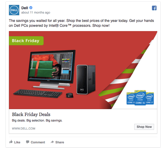
Holidays arent’s really there before Black Friday’s sale starts. Dell’s ad has a clear and straightforward message, leaving no room for misunderstandings. Notice how many action verbs there are in the ad copy. By using call-to-actions like “buy now” and “shop now”, you’ll increase people’s readiness to click on the ad. Test adding a call-to-action to your ad headline for even better results!
2. Target
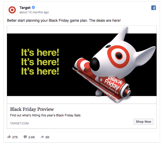
There are so many great things about this Facebook ad (and 27k likes and 2.6k comments prove my point!!). Target’s ad is easy to notice in a crowded newsfeed and the ad message “It’s here!” makes everyone question “What’s here?” By the time people have seen the ad image, they’re interested in finding out more. Check how this ad isn’t even a Black Friday announcement. It features the preview, building on anticipation and curiosity.
3. Oreo
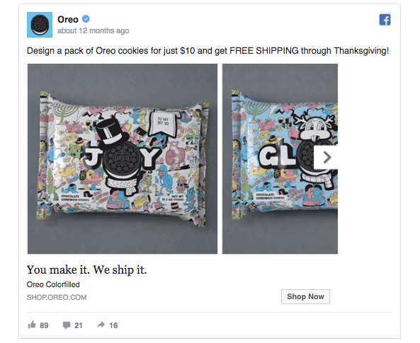
Oreo’s Facebook ad is super straightforward: “You make it. We ship it”. Similarly to the previous ad, it creates some mystique around the offer: “What can I make…?” Moreover, using caps lock to highlight some of the key messages in your ad copy is a great way to lead people’s attention to the right details. Make sure to A/B test multiple ad texts this year to find the holiday ad with the lowest cost-per-click.
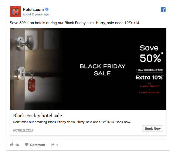
4. Hotels.com
Hotels.com has used high color contrast to create an eye-catching Facebook ad design. This ad creates a sense of urgency by showing the end dates for the offer. When promoting a sales offer, test with verbs like “hurry” and “don’t miss out” to increase the FOMO (fear of missing out) and make more people click on your ad.
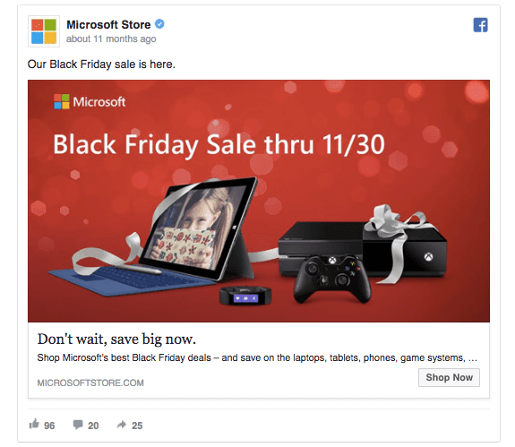
5. Microsoft Store
All tech companies seem to prefer the red background for their holiday ads. It’s a logical choice, considering that it’s the color associated with Christmas. But there’s another reason for using red: it contrasts with black and gray. When creating your holiday ads this season, keep your ad image colors contrasted for better visibility.
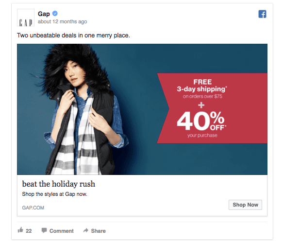
6. Gap
Gap’ s Facebook ad is straightforward and sharp. First, the ad image has high contrast which makes it easily seen in the News Feed. Second (but not secondary), Gap has combined two offers to make the prospect of a purchase more compelling. When promoting sales offers, test adding a large red button or circle in your ad image and mention the size of the discount. People are already used to relating percentages to discounts, so they’ll notice your offer more quickly.
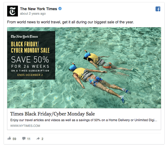
7. The New York Times
The reason why this ad caught our eye is that it’s a little weird. I mean, who wouldn’t stop and read this ad’s copy after seeing the image… Check how the ad messages are placed in a black box in the image – it’s a great (and stylish) way to use text on a colourful image. The New York Times uses the number “26 weeks” instead of “6 months”, making the numbers look bigger and the offer a better bargain. When writing your Facebook ad copy, think about different ways of using the same number – 52 weeks sounds a whole lot better than 1 year.
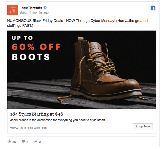
8. JackThreads
There are many things right about this ad: it uses lots of numbers and it creates a huge sense of urgency by using the words like “NOW” and “Hurry”. JackThreads’ Facebook ad image features a product with a discount offer. Remember that whenever you create a Facebook ad campaign that promotes a discount, all the products shown in the ad image should be available and discounted on your website.
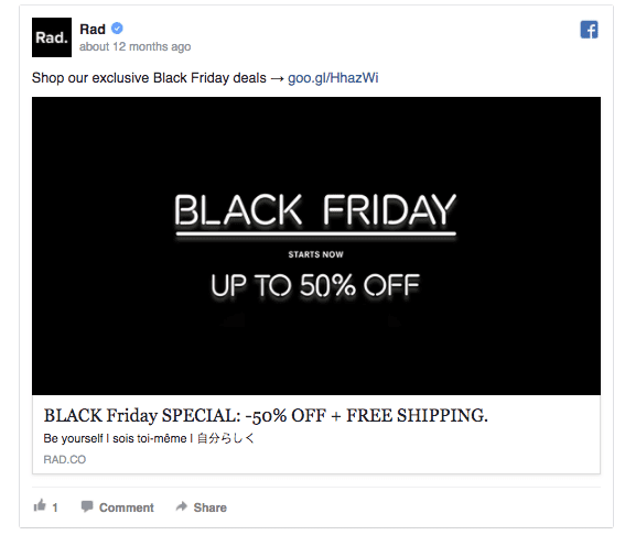
9. Rad
Here’s another great example of how to create a powerful Facebook ad image without hours of hard work. Sometimes, a simple background with a great value offer will do the magic. Rad’s Black Friday ad is interesting for another reason: it features one message in three languages. If you’re in doubt what text to include in your ad, your brand slogan’s always a good idea as it helps to increase brand awareness.
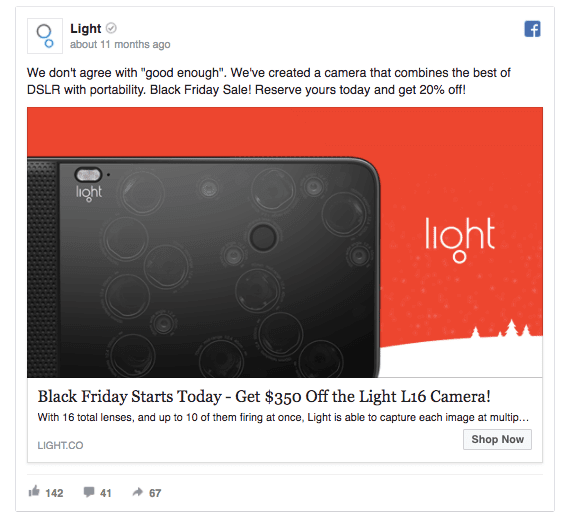
10. Light
People love Black Friday sale. That’s why it’s useful to add this piece of information to your ad copy – it validates your offer. Light has successfully played with the numbers to achieve the maximum effect. When advertising discount offers, consider which number has a bigger impact: a percentage or the amount of dollars saved. If you had to choose between -20% and -$350, the latter is clearly a better option.
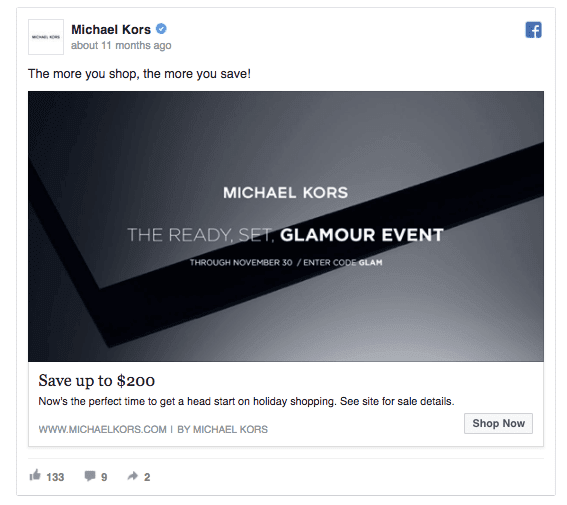
11. Michael Kors
Michael Kors uses a sales approach that helps to skyrocket their sales: the savings increase with the spending. When setting up a Facebook or Instagram ad campaign, remember to include the right call-to-action so that people will know what’s expected of them. Read this article to learn more about the best call-to-action buttons for your Facebook ads.
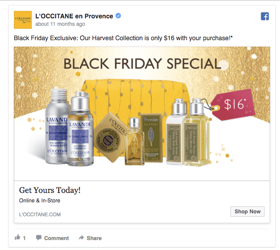
12. L’OCCITANE en Provence
You already know that it’s a good idea to include your product on your ad image. The next step would be to deliver the core message in your ad image as well and use your ad copy to specify the offer. That’s exactly what L’OCCITANE en Provence has done with their Black Friday Facebook ad.
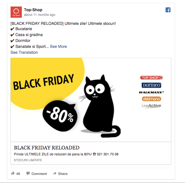
13. Top-Shop
This ad reminds us that Facebook allows using emojis and other icons inside the ad copy. Make sure to check it out this year! Another good idea is to list the logos of well-known brands. Even when the effect is unconscious, people will trust your brand more when seeing familiar logos besides yours.
14. Veeam Software
Veeam Software’s Facebook ad example has combined merry holiday greetings with a generous offer: a chance to win $10,000 to build a Home Lab. Instead of framing their offer as a competition, Veeam makes it sound as a friendly giveaway. That’s a nice example of powerful copywriting. This ad is also a good example of how a simple image design can look highly authentic (compared to generic stock images).
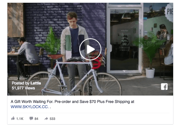
15. Lattis
Sometimes, we get so caught up with the ad image and copywriting that we forget about all the other options. How about creating a video ad this holiday season? According to Adobe, shoppers that watch videos are 1.81 times more likely to purchase than non-video viewers. That’s an almost 85% increase in your Facebook Ads ROI.
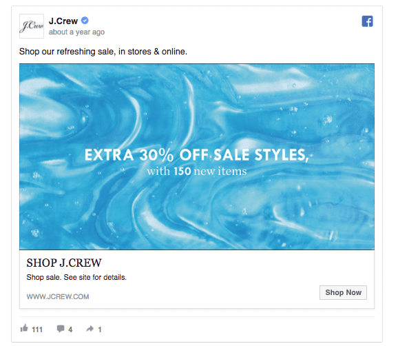
16. J.Crew
J.Crew’s ad is efficient because it’s simple. This type of ad works great for a remarketing campaign as people are already familiar with your brand and interested in a discount offer. If you notice that your sales campaign isn’t taking off as fast as you’d like, include additional offers to boost the website traffic (and purchases).
17. Cadbury
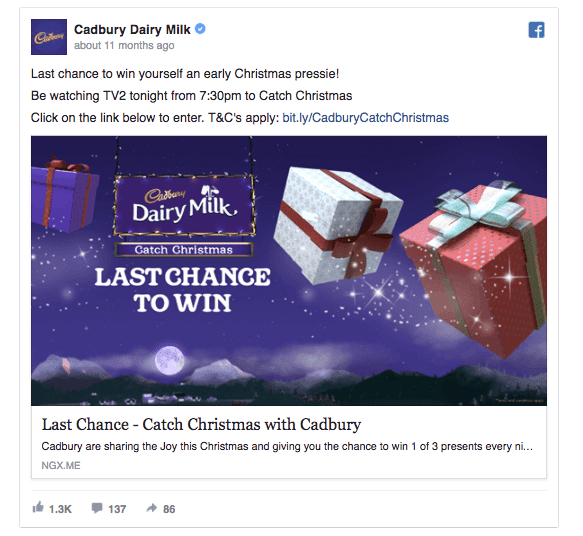
Cadbury hasn’t just created a Facebook campaign around a promotion, they’re intending to make someone’s holidays better with a present. Creating a giveaway is a great way to attract engagement and remind people of your brand. Many people who don’t win the prize will buy a chocolate anyway. There’s one more thing… Cadbury’s ad makes us feel all Christmasy. Adding some holiday elements to your ad image is the quickest way of giving it a wintery touch.
18. Target
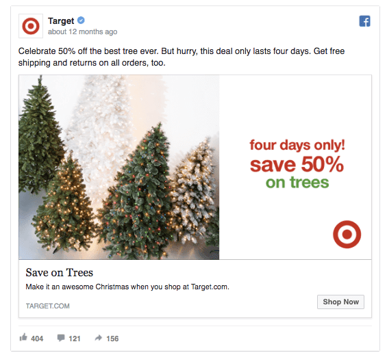
Target’s ad is right on point with a timely offer. Who wouldn’t like to a have a Christmas tree in their home. Target not only offers something that people want but gives it away with a 50% discount. But the offer gets even better as Target offers free shipping and returns. Using this kind of multi-layer funnel of convincing people to buy can help you significantly increase sales with your Facebook ad campaign.
19. AT & T
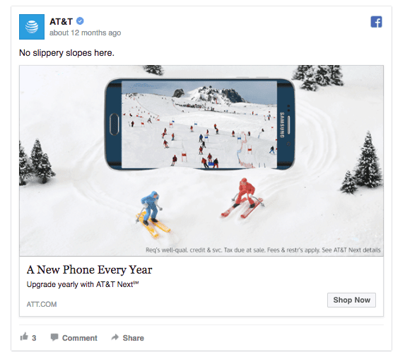
With the New Year right around the corner, people start to think about making the next year extra awesome. AT & T offers a deal of “New Phone Every Year”. As it’s the end of the year, people are more likely to imagine themselves getting a new phone right when the number changes from 2016 to 2017. Takeaway: center your holiday campaign around the New Year and help people to improve their lives in the upcoming year.
20. Mixbook
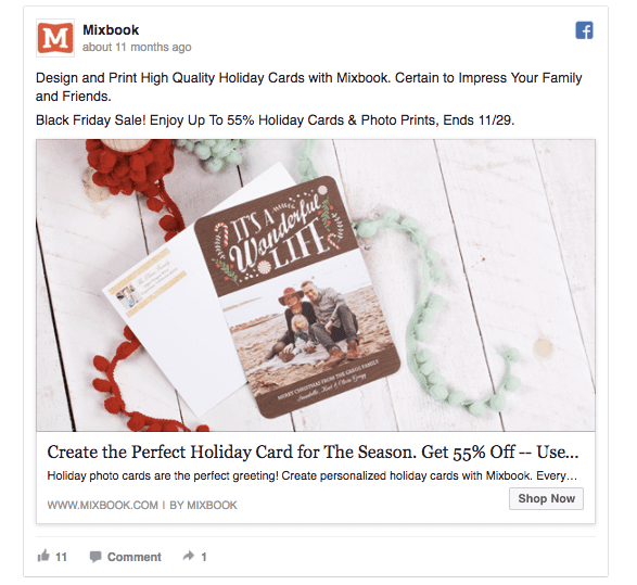
One of the best things to show on your ad image is your product. It helps to keep your Facebook ad design and branding aligned and gives customers a peek at your product. Mixbook’s ad feeds the viewer’s imagination and makes them consider a custom holiday card as a potential gift. The ad image features an ordinary family, making it relatable to a large audience. Tip: When creating this year’s holiday Facebook ads, make sure that your ad image and ad copy speak to every member of your target audience.
21. Dollar Shave Club
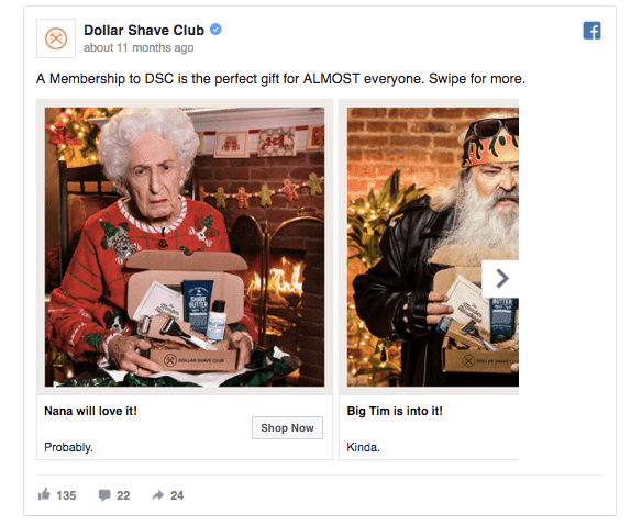
While everybody’s busy promoting sales offers and getting people to buy with last-minute offers, Dollar Shave Club takes a different approach. Their ad suggests that the product is a perfect present to many people you know. Well, they might not be 100% serious about the nana, but the ad gives you the idea that many friends would appreciate a box from the Dollar Shave Club as a holiday present. Not all Facebook ads need to be serious. Test adding a fun element to spice up your ads.
22. Virgin America
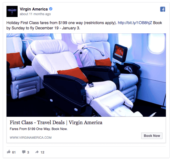
Virgin America’s ad uses lots of numbers. In fact, by starting your headline with a number, you’re 36% more likely to have people click on your ads. People love to see the numbers as it makes your offer easier to grasp. Another reason why we like Virgin America’s holiday ad is that it shows exactly what you’ll get.
Read more: 8 Startling Discoveries to Write Powerful Facebook Ad Headlines
23. Bluehost
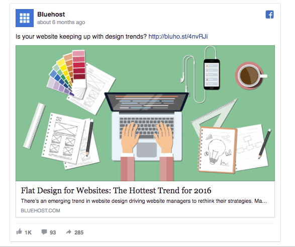
As the new year approaches, people are looking for guides and tips to succeed in the upcoming year. Holiday season is a great time for content marketing and boosting your readership with some extra Facebook promo. Create a helpful list of the next year’s trends and share it with your audience to increase traffic to your website and build brand reputation.
24. Boxed
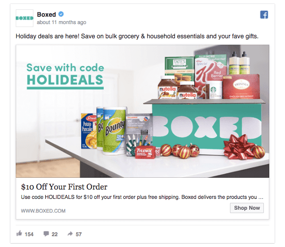
Instead of simply promoting their products, Boxed urges people to make their first order by offering a $10 discount. Always add your most important message to your ad headline for the maximum visibility. Research has shown that 80% of readers never make it past the headline, so make it count!
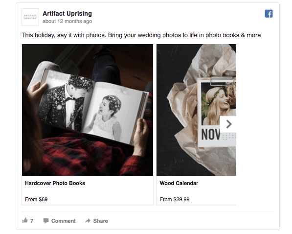
25. Artifact Uprising
Nobody escapes from the question: “what’s the perfect present for…?”. Artifact Uprising’s ad answers this very question by offering a simple solution – a personalized product. If you’re planning to promote a product that could potentially be a present, create ads suggesting that your product is a great gift. Another great thing about this ad is that it’s a carousel ad, making it possible to showcase multiple products at once. This way, you increases your chances of someone seeing a product they like and make a purchase.
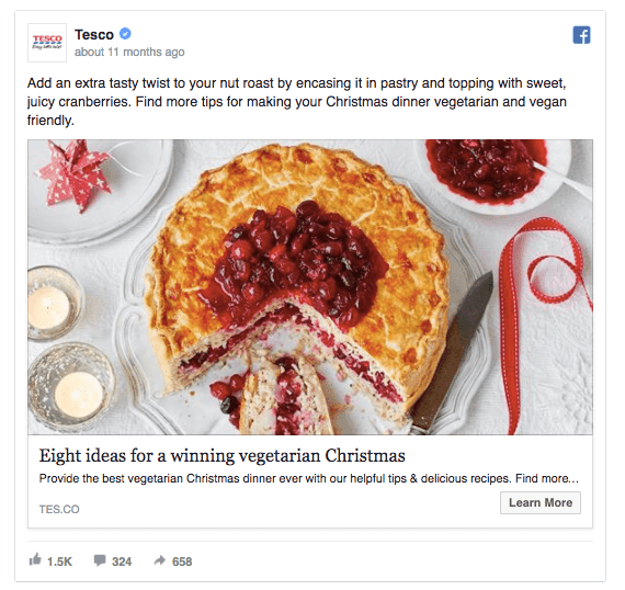
26. Tesco
While many competitors are offering discount rates and trying to get people to shop, Tesco takes another approach. This ad focuses on a niche audience (vegetarians who love to cook) and provides them with helpful holiday advice. If you’re still looking for a good idea for your holiday campaigns, why not write a blog post on how your product/company can help people improve this year’s holidays.
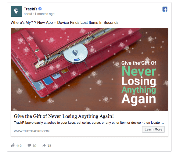
27. TrackR
TrackR’s ad lists a great benefit (“Never lose anything again”) and repeats it twice to make the message more powerful. In case a reader is still hesitating how the product works, the ad’s link description gives a brief overview of how to use it. Tip: use photoshop to add some snowflakes to your product image for a quick Christmas ad layout.
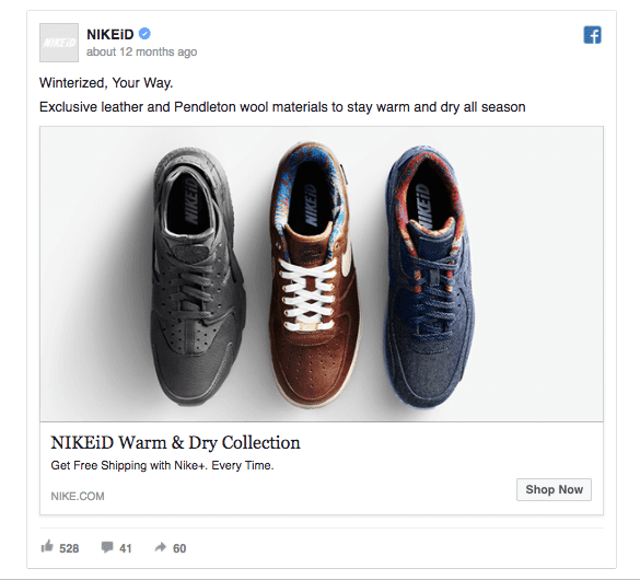
28. NIKEiD
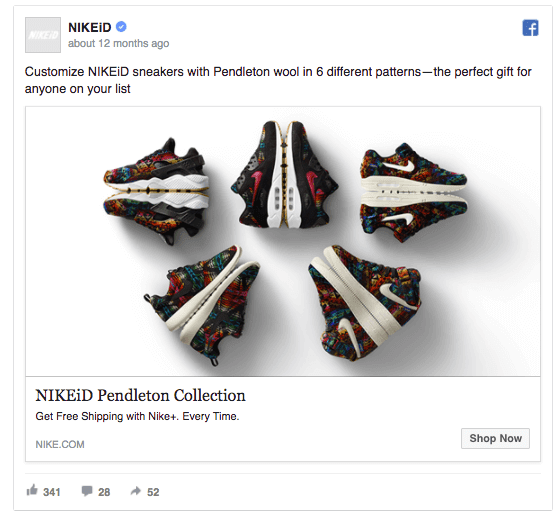
What are the first ten words that come to mind when thinking about holidays? Presents? Snow? Cold? NIKEiD knows that people are struggling to keep their feet warm and dry in the winter season, so they’ve created an entire product line to cure the problem. Providing helpful products is the best way to keep people interested and increase your sales. Think about the greatest benefit your product brings to people and write your ad copy around this value.
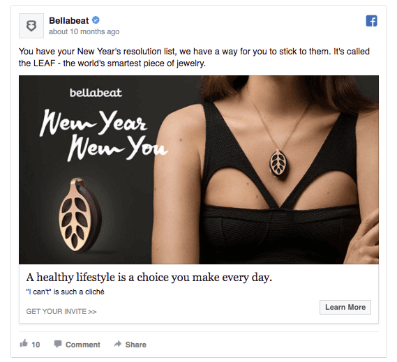
29. Bellabeat
People love making Ney Year’s resolutions and most of the time they’re about improving oneself: eating healthy, learning something new, being a better person, etc. Bellabeat’s Facebook ad uses this knowledge to promote their product as a helpful way to achieve the New Year’s goals. No matter if you’re selling software, beauty products, ice cream or cars, all of these products help to improve your audience’s lives. So why not tie your holiday offer around people’s New Year’s resolutions.
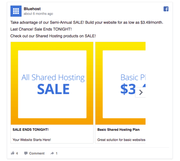
30. Bluehost
Bluehost’s has chosen positive ad colors that people are likely to notice. This ad teaches us the lesson that you don’t need to be a graphic designer to create powerful Facebook ad designs, some basic Photoshop skills will do. Keep in mind that contrasting colors are more likely to have a positive effect on your ad’s click-through rate.
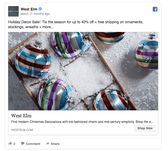
31. West Elm
Holiday advertising is all about the right timing. If this ad from West Elm reached the audience on December 24th, it would be way too late. Be careful not to miss the right timing by planning well ahead and publishing your Facebook ad campaigns at least 24 hours before you need them to show in the News Feed (it takes Facebook 24 hours to adjust to your ad settings, and start delivering full-speed).
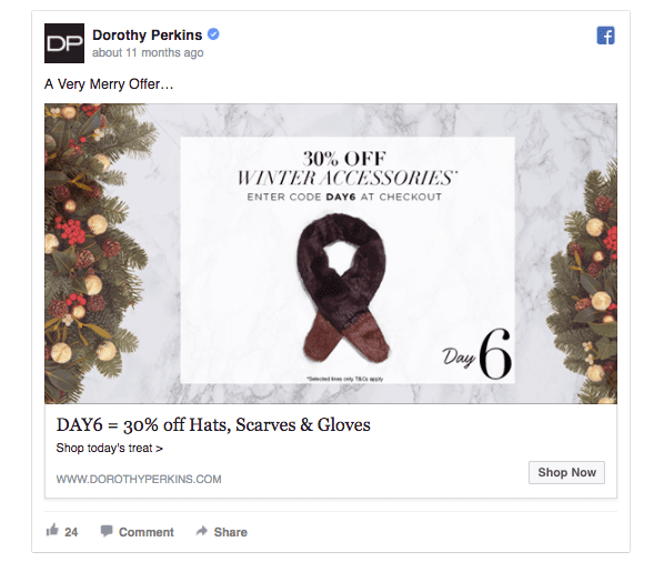
32. Dorothy Perkins
Christmas calendars! Who wouldn’t love them, right? Holiday season’s a great time to create a calendar of daily promotional offers. As people know that each offer only stands for one day, they’ll act quickly to get it. If you don’t have 24 different offers for a holiday countdown campaign, offer a bargain each week-end.
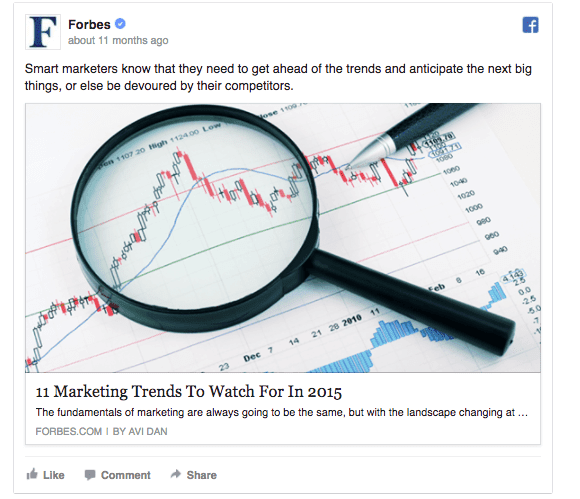
33. Forbes
When creating list posts, it’s important to find a headline that makes people click. Outbrain collected data from 150,000 article headlines and discovered that headlines with odd numbers have a 20% higher clickthrough rate than headlines with even numbers. Instead of creating headlines with numbers 6, 8, and 10, use numbers 9, 11, and 15 to increase your click-through rates.
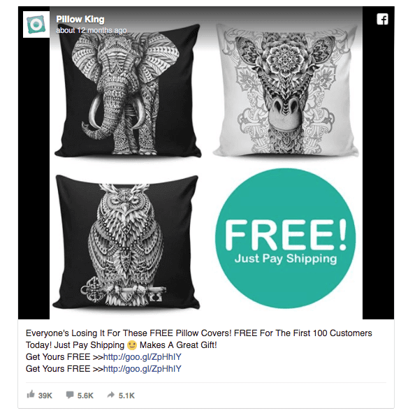
34. Pillow King
As people see multiple likes and shares below a Facebook ad, they’re more likely to engage as well. The likes and shares serve as valuable social proof. Instead of running tens of ads at once, Pillow King has focused on promoting a single ad to a wide audience, gathering over 39 thousand likes. While promoting a single offer to all your audiences isn’t always a good idea, it’s worth considering this holiday season.
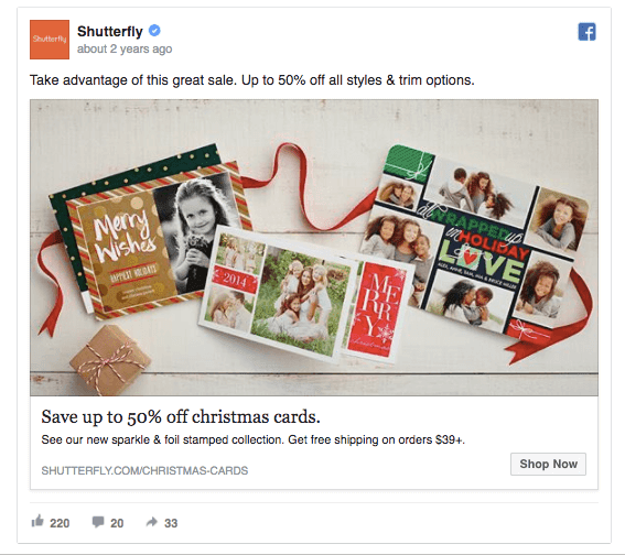
35. Shutterfly
Shutterfly’s holiday ad headline is about a timely benefit, making people interested in finding out more. Remember that you need to provide real value with your ad offers in order for people to take action. Make your ad copy about emphasizing how your product will help your audience. Even better if your ad image carries the very same message.
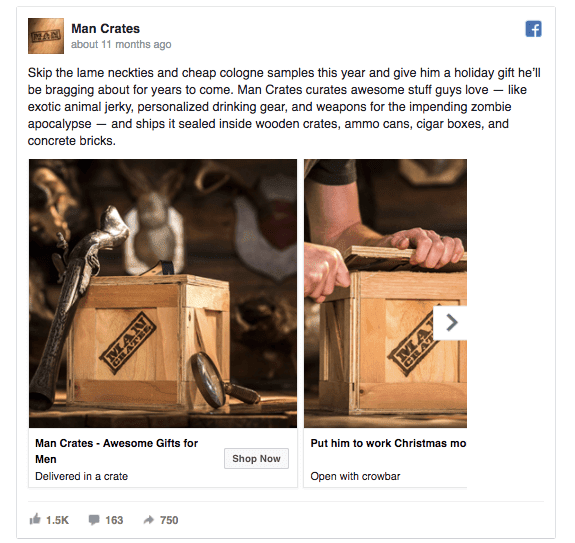
36. Man Crates
Man Crates has mastered the art of great copywriting. Instead of making generic promises, they’re using authentic language that’s part of their entire user experience. People love brands with personality, so you might want to take a few extra hours to craft the perfect ad copy. This holiday ad uses a carousel ad format to tell a story – the first image reads “Delivered in a crate”, the second says “Open with crowbar”… Now wouldn’t you want to know what’s coming up next?
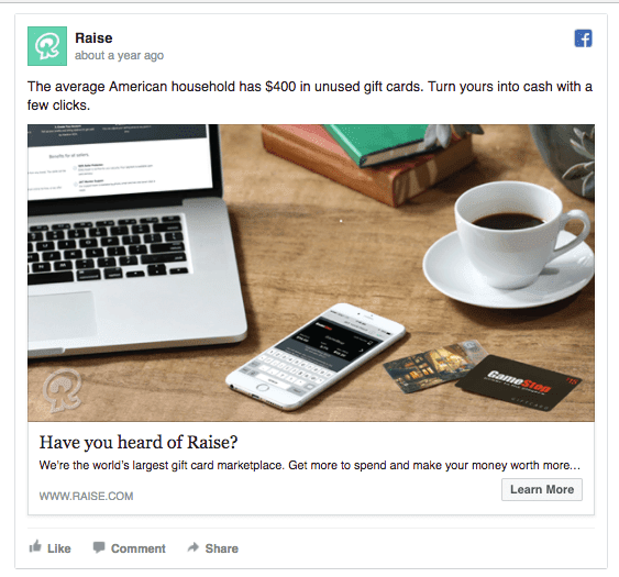
37. Raise
Raise uses an interesting fact to catch people’s attention: “The average American household has $400 in unused gift cards.” Using fun facts in your ad copy is a great way to surprise people and make them share their newest discovery. Even better if you can present an interesting fact and then provide a solution to the problem, just like Raise has done.
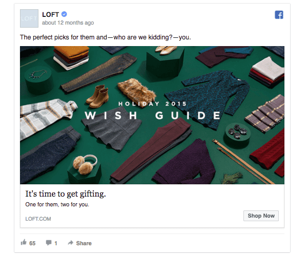
38. Loft
Loft’s ad presents the brand as an expert in holiday gifts. Creating a holiday buying guide is a great way to show your products while helping people to find the perfect gift. If you sell multiple brand’s products, you can create a gift catalogue to give a quick overview of all the options you provide. People who read your guide will feel grateful for the advice and are more likely to buy an item from your site (don’t forget to include a “buy now” link beside each featured product!).
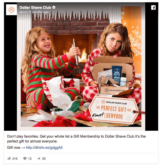
39. Dollar Shave Club
This Facebook ad by Dollar Shave Club almost screams “Christmas!!!”. People like to see holiday ads that make them feel merry and happy. If you’ve got a strong ad message like Dollar Shave Club’s “the perfect gift for everyone”, you’ll be able to create a strong Facebook holiday campaign around it. Often, it’s best to start with the core message of your ad campaign and then proceed with the exact ad copy and layouts.
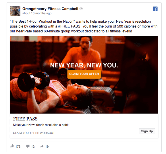
40. Orangetheory Fitness Campbell
This ad has probably one of the most efficient headlines we’ve seen: “FREE PASS”. Another great thing about this ad is the call-to-action button in the ad image. It gives an instant overview of what you’ll get by clicking on the ad and it’s so actionable people will want to click.
41. House of York
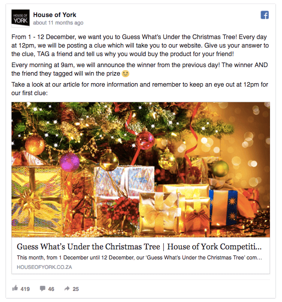
House of York has created a fun competition, asking people to guess what’s under the Christmas Tree. Holiday competitions are a great way to get people to engage with your brand and its Facebook page. Ask people to tag a friend for increased organic reach and lower ad costs. As you create a Facebook campaign, make sure to include specific participation rules so that people will know how to play.
42. Indigo, Chapters and Coles
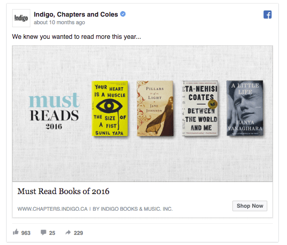
Here’s another great example of a helpful list post that summarizes the year and gives suggestions for the upcoming year. Indigo, Chapters and Coles has compiled a list of the must-read books of 2016, showing their expertise while attracting potential buyers. Tip: If you feel like your Facebook ad’s link description isn’t helping the conversion, why not leave the box unfilled.
43. AT&T
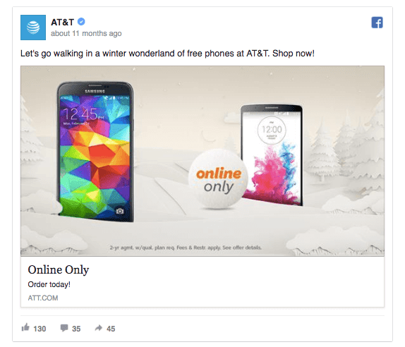
AT&T’s holiday ad keeps the ad headline and link description to the minimum length. This goes well with their ad’s overall simple layout and light tones. Using shorter ad copy increases the chances of people actually reading them. The general rule is to keep your ad messages as short as possible, but as long as needed.
44. SurveyMonkey
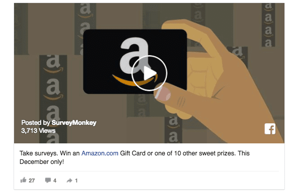
SurveyMonkey has created a limited-time offer that lasts for one month. This leaves enough time for people to participate while reminding them that the clock’s ticking. Another nice thing about this ad is the video: SurveyMonkey has created a special video to accompany the Facebook campaign.
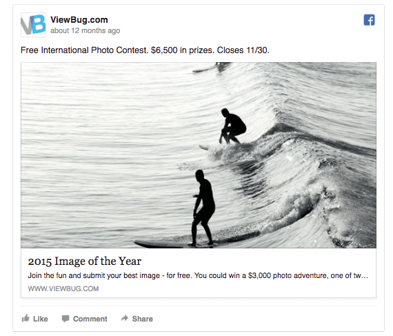
45. ViewBug.com
In addition to creating end-of-year listicles, why not create a yearly competition like ViewBug.com has done. The possibility to win $6500 in prizes in enough to get even the busiest people sending in their photos. Whenever you create a Facebook competition, make sure that the final prize is compelling enough to get people participating.
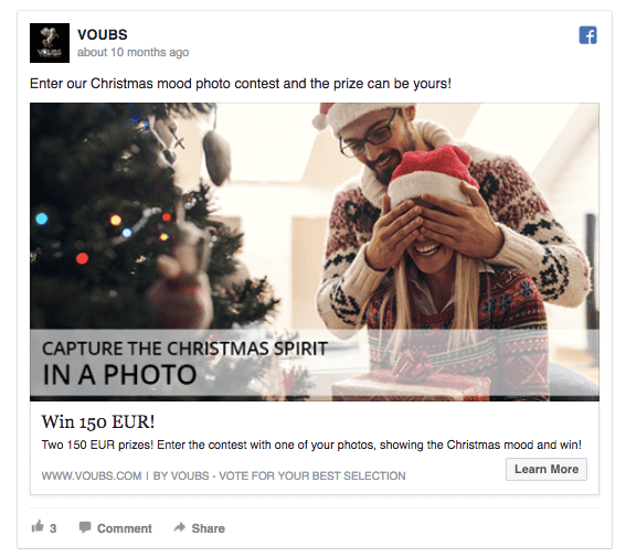
46. VOUBS
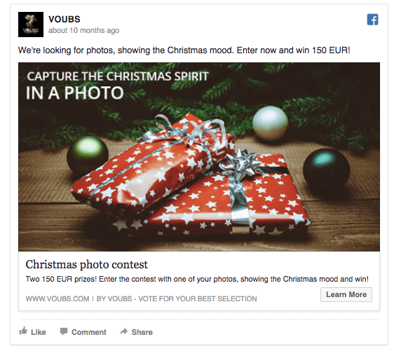
Similarly to ViewBug.com, VOUBS has created an end-of-year photo competition. Only this one has a more personal approach, suggested by the ad image. Before you announce an online challenge, think who’s the audience and if they’re qualified to participate. VOUBS’s ad appeals to amateur photographers why ViewBug.com focuses on attracting professionals.
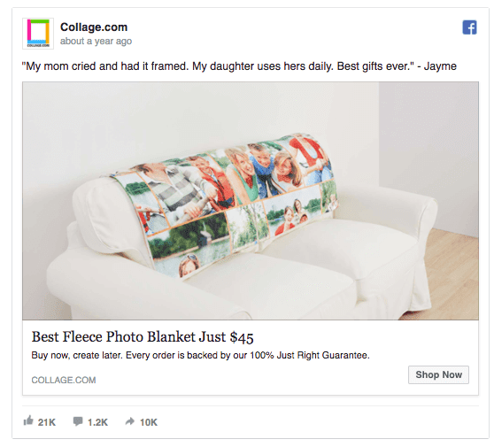
47. Collage.com
If you’ve got a chance to add a way of personalizing your products, do it! People love personal gifts and the holiday season is the best time to advertise these products. What makes this ad by Collage.com great is the client testimonial they’ve included in the ad text. Adding social proof to your Facebook ads will help to create trust, and contributes to higher engagement rates.
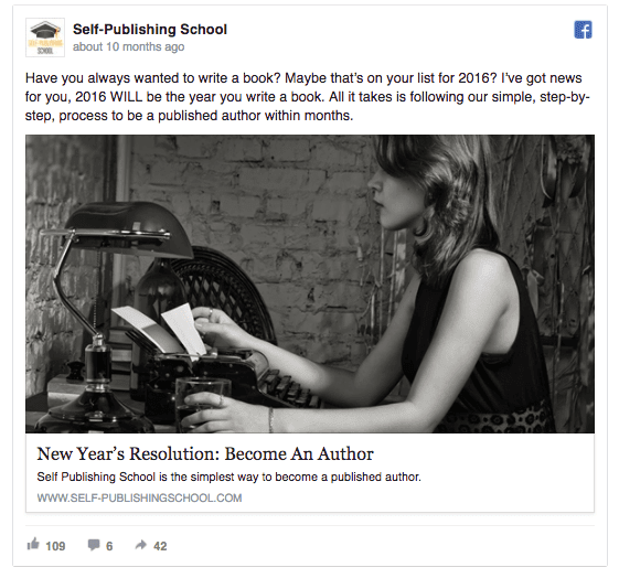
48. Self-Publishing School
While most of the advertisers are creating colourful and merry holiday ads, one way to shine out from the crowd in to use black-and-white images. Here’s an idea: create an A/B test to see which works the best: a regular picture or the same image with a B&W filter.
49. PAUL HEWITT
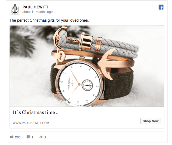
This Christmas ad repeats all we’ve learned about efficient Facebook ads: the ad image features the product, the ad copy’s simple, and the benefit loud and clear. Sometimes, these three core requirements are all it takes to get your loyal fans click on your ad.
50. Drones Etc.
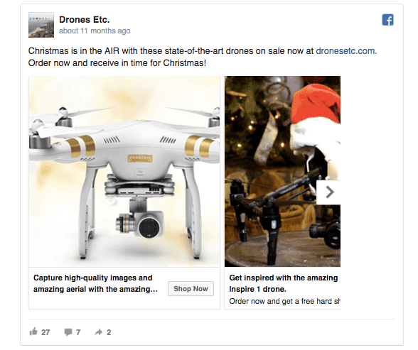
This holiday ad combines the promise of a great Christmas gift with a sales offer. Often, all it takes to get people to buy is a little nudge, and a discount offer might do the job. This ad’s also a good example of using carousel ads to show your products in multiple settings, making it easier to imagine actually using them.
51. VOUBS
VOUBS’s deserves another mention just to showcase how it’s Christmas campaign uses multiple image variations to appeal to different target audiences. Make sure to split test your Facebook ad elements before assigning a large budget to a single ad variation!
52. NIKEiD
NIKEiD’s Facebook ad image is a good example of presenting your products in an interesting way. Before you take a photo of your product, think what’s the very best way to present it. Moreover, this ad suggests that the sneakers would make a perfect gift for anyone on the list, resolving the question “What am I supposed to give them as a gift…?”
53. Target
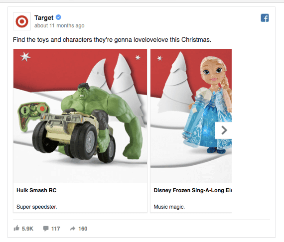
Target’s carousel ad features toys that could potentially appeal to both girls and boys. Including products that speak to multiple audiences is a great way to create one ad that fits all. Also, notice how well Target’s carousel ad is laid out across multiple frames, making it more consistent and professional-looking.
54. Skyscanner
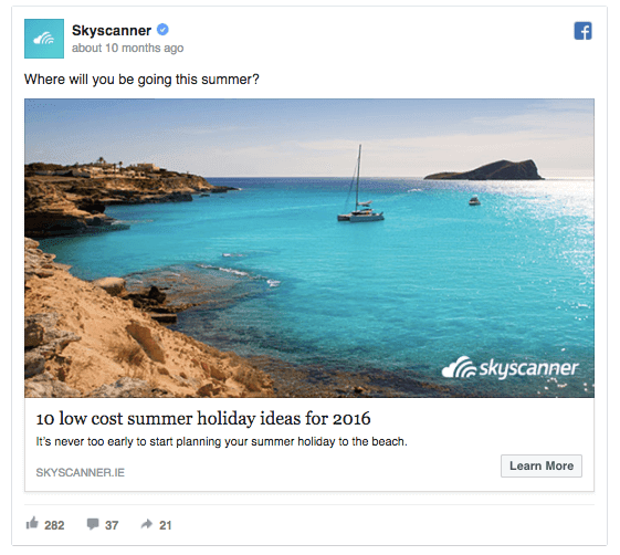
This Facebook ad by Skyscanner makes people think about their summer holiday well in advance. Anyway, as people might not be interested in buying a travel right this moment, it’s a better idea to share a list with helpful suggestions. The next time someone’s planning a vacation, Skyscanner’s on top of their mind. Tip: While everybody’s rolling out holiday-themed ads, think a few months ahead and start promoting products that people might want in the upcoming months.
55. Skillshare
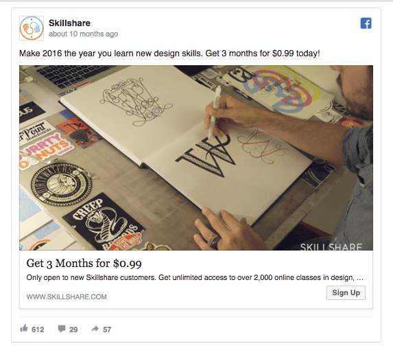
Skillshare offers to help us learn new skills in the upcoming year. As their ad runs throughout the holiday season when people are more likely to have spare time, Skillshare will collect lots of new subscriptions. Include numbers in your ad text to convince people that your product’s trustworthy and reliable. Also, ensure that your ad image aligns with your ad copy, just like in this example.
Holidays are about happiness and kindness. and SALES too!
Make sure that your holiday Facebook ads provide real value to your audience and shine out in the competitive News Feed. Hope we helped. Happy holidays 😀 😎

So what kind of ads do you think these were? Traffic ads, PPE ads, Reach ads, Conversion ads? Because they weren’t focusing on a specific product, most of them were promoting their entire brand.