At AdEspresso we often get asked: which is the best Facebook Ad Format? Which one will yield your business the best results?
Should you invest to produce a fancy video? Or would a simple image ad work? Or maybe it’s better to showcase more products with a slideshow? And what about the Facebook instant experience? Should you go all-in on mobile?
These are all serious, well-founded questions for which we must find the answer.
At the heart of any successful advertising campaign is, of course, the ad creative itself. And so the type of ad unit you choose can make or break your Facebook ad campaign.
In this experiment, we are going to put three of the most common Facebook ad formats – image, slideshow video, and carousel – in a head to head test.
Which one will win? Read on to find out.
In our previous $1,000 experiments, we’ve covered the other elements that we can control in a Facebook ad campaign including the audience, the optimization type, and the landing page.
However, it’s the ad creative that Facebook users view and interact with.
In total, Facebook lists six different ad formats:
- Image
- Video
- Slideshow
this is a subtype of the video ad where multiple images can be combined with text overlays and sound and turned into a video. - Carousel
this is a single ad that contains up to 10 cards, each card can be an image or video. - Instant Experience
this is a new and improved version of Facebook’s Canvas ads. It’s a visually compelling, immersive, full-screen experience that opens after someone taps your ad on a mobile device. - Collection
this is a format that features multiple products from your product catalog and opens as an Instant Experience when someone interacts with it.
Experiment Goal
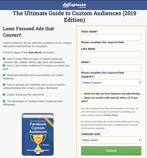
The aim of the experiment was to drive traffic to a landing page and get signups for our Ultimate Guide to Custom Audiences eBook.
Optimizing for leads and measuring the cost per lead is how we will determine the ultimate winner.
Experiment Hypothesis
We wanted to measure cost per lead so that we could monitor which ads drove conversions, as some ad types might be good for engagement but might not get users to actually take action.
We conducted a small poll in our Facebook group for AdEspresso customers and the predictions for the winning ad type (the one with the lowest cost per action) were:
- 11 votes for Facebook video ad
- 9 votes for Facebook image ad
- 3 votes for Facebook carousel ad
So AdEspresso prediction was for video ads to perform the best.
As well as cost per lead we could also log the number of clicks, the cost per 1,000 impressions (CPM), the amount of engagement and the number of video views to build up a wider picture of how the ads performed.
The Ads
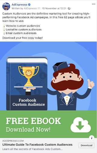
We started by creating the image ad, similar to what we had used in our previous $1,000 experiments, so we knew it had a good chance of success and should generate plenty of conversions.
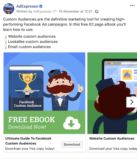
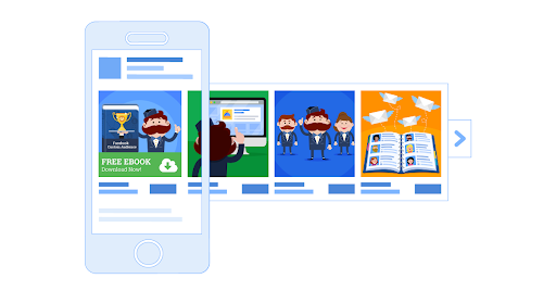
Next up was the carousel ad which used four cards. An end card wasn’t used and we allowed Facebook to determine the order in which the cards were shown.
The first graphic was the same as for the image ad, and the other three covered website custom audiences, lookalike audiences, and email custom audiences.
Here’s the ad preview:
And this is how the carousel looks when a user is interacting with it:
From the carousel graphics, we created a slideshow video using the slideshow creation tool in Facebook Ads Manager.
A text overlay was added so that the information conveyed was similar to the carousel.
No sound was included and we then exported the video to AdEspresso and the video thumbnail we used matched the graphic in the single image ad.
Throughout the design process, the intention was for the ad creative to be as similar as possible given the constraints of each ad type, with the same ad text being used in each ad.
Experiment Setup
⇒ Campaign structure:
One ad per adset (carousel, image or video), so three in total.
Although this could cause some internal competition, the amount should be small given the large audience size and relatively low budget.
The ads were separated into different adsets to ensure they all got the same amount of budget.
⇒ Audience
A 1% lookalike was created based on current 180-day leads.
We targeted US only, males and females, ages 18+. Current leads and AdEspresso customers were excluded. The audience size available to target was 1.7 million.
⇒ Placement
Facebook mobile newsfeed.
⇒ Budget
$100 a day for 10 days, $1,000 in total.
This was split between the three adsets so $33 per adset per day.
⇒ Bid Strategy
Lowest cost, no cap
⇒ Optimization
We optimized for conversions, tracking the Lead event.
Experiment Results
Each ad type spent $333 and in this case, CPA means the cost per lead:
We also measured the engagement for each ad type:
- Image: 21 reactions, 1 comment, 5 shares
- Video: 23 reactions, 1 comment, 9 shares
- Carousel: 9 reactions, 5 shares
The video ad also got:
- 885 3-second video plays at a cost of $0.38 per view
- 234 10-second views at a cost of $1.42 per view
Experiment Conclusions
The image ad was the winner with the lowest cost per lead
Furthermore, it had a cost per click equal to that of video and a level of engagement not far behind video.
Carousel performed poorly with a cost per lead 2.8 times higher than the image ad, plus a high cost per click and a low rate of engagement.
The conclusions we can draw are:
-
The ad type can make a significant difference to your campaign results
So once you have your assets (images, videos, and text) run some experiments to find which format your audience responds best to.
If a campaign isn’t working for you, before starting over with a completely new set of creatives see if you can adapt your current assets.
-
Classic image ads still work really well
There’s a temptation in advertising to chase the latest new thing, and while innovation can be useful to make your brand stand out, images are quick and cheap to produce so you can get good results very quickly.
-
The video ad got a high number of video views
This could be turned into a video view custom audience for remarketing, this can be useful for complex products where more than one ad is required for the prospect to understand the offer.
-
Carousel ads aren’t always the best
Many advertisers are tempted to put as much as possible in the ad, their thinking being that if one image doesn’t engage there’s another 4-6 that might resonate.
However, on Facebook the mantra “less is more” often applies, especially as 94% of Facebook ads are served on mobile devices, and that small screen means you need a clear uncluttered ad to make an immediate impact.
Sales Funnels
There is one disclaimer we need to give: it’s possible that the best ad format depends on the stage in the sales funnel.
For the first interaction with the user at the top of the funnel, often an image or video ad has more impact, as we saw in this experiment. However, lower down the funnel when we move from awareness to getting the prospect to pick an option, often a carousel is a great way of displaying the available choices.
As an example, for an eCommerce store selling t-shirts an image ad showing a single t-shirt with a funny slogan on it could work well for cold traffic.
Then, when it comes to retargeting recent website visitors, that’s when a carousel ad showing the various colors available could convert.
The take-home message is:
Carousel ads still have their place, but think about the user journey and how much information the user needs at that stage in the sales funnel.
Final Thoughts
We hope this experiment gives you a brief insight into the different ad formats available on Facebook.
The good news is with images performing so well it’s very quick and low cost to create high performing ads.
As Nike say, Just Do it!
Start with some image ads, using either some photos taken on your phone or if you use graphics they can easily be outsourced to a graphic designer when starting out.
Once you start building up engagement, leads and most importantly revenue for your business then you can afford to invest in video and tell stories using carousels or instant experiences.
Which ad format do you prefer? Have you seen similar results to us? Let us know your thoughts in the comments below.

Really an amazing experiment. You have shared some very insightful conclusions by doing this experiment. It was very interesting to know that the image ad had a CPL of around 2.7$ while video and carousel had CPL of over 3$ &7$ respectively. I will also think of doing some testing and see if image ads get more leads for my campaigns. Thanks for sharing your campaign experiment results in this blog post.
When you see the image ad you think that there is too much text in the ad, and it should get a penalty for this. But this was not the case? Was this a conscious design of yours, to get in as much text in the ad but still avoid penalty?