Visuals can make or break your performance with Instagram ads. This makes Instagram ad design an essential part of the ad creation and management process.
While copy, strategy, and targeting all matter for Instagram ads, the design of the visual element of the ad itself is crucial. You need strong visuals to capture attention so users stop scrolling through their feed or their Stories. Without that, you’ll never get them to actually take the time to read the copy (let alone click!)
But good news. Instagram ad design can be easy when you have a solid list of best practices, dimensions, and tools to get you started.
10 Instagram Ad Design Tips
There is no one set way to make an outstanding Instagram Ad, and there’s no hard and fast rulebook that you really need to follow. (Except for Facebook’s advertising rules, you do need to follow those).
That being said, there are a lot of design tips you can choose to incorporate as they’re relevant to your images that can help increase their performance overall.
To keep things simple, we’ve compiled a list of 10 of the best Instagram ad design tips out there that can help you step up your game for any campaign.
1. Use Plenty of Contrasting Colors
This is one of the easiest-to-implement and most reliable Instagram ad design tricks in the book.
Add one or two contrasting colors in your image so that they pop. Contrasting colors can draw the eye in, focusing the user’s gaze exactly where you want it: On your ad.
When it comes to thumb-stopping techniques, this is an easy one, because the user subconsciously will stop to see what is jumping out at them.
2. Keep the Text to a Minimum
Instagram Ads is a part of Facebook’s system, which means they prefer ads with minimum (read: less than 20% of the image) ad text. It’s also a good practice in general. You need your ad to stand out, and blocks of text will be overwhelming, not visually appealing, and not click-worthy.
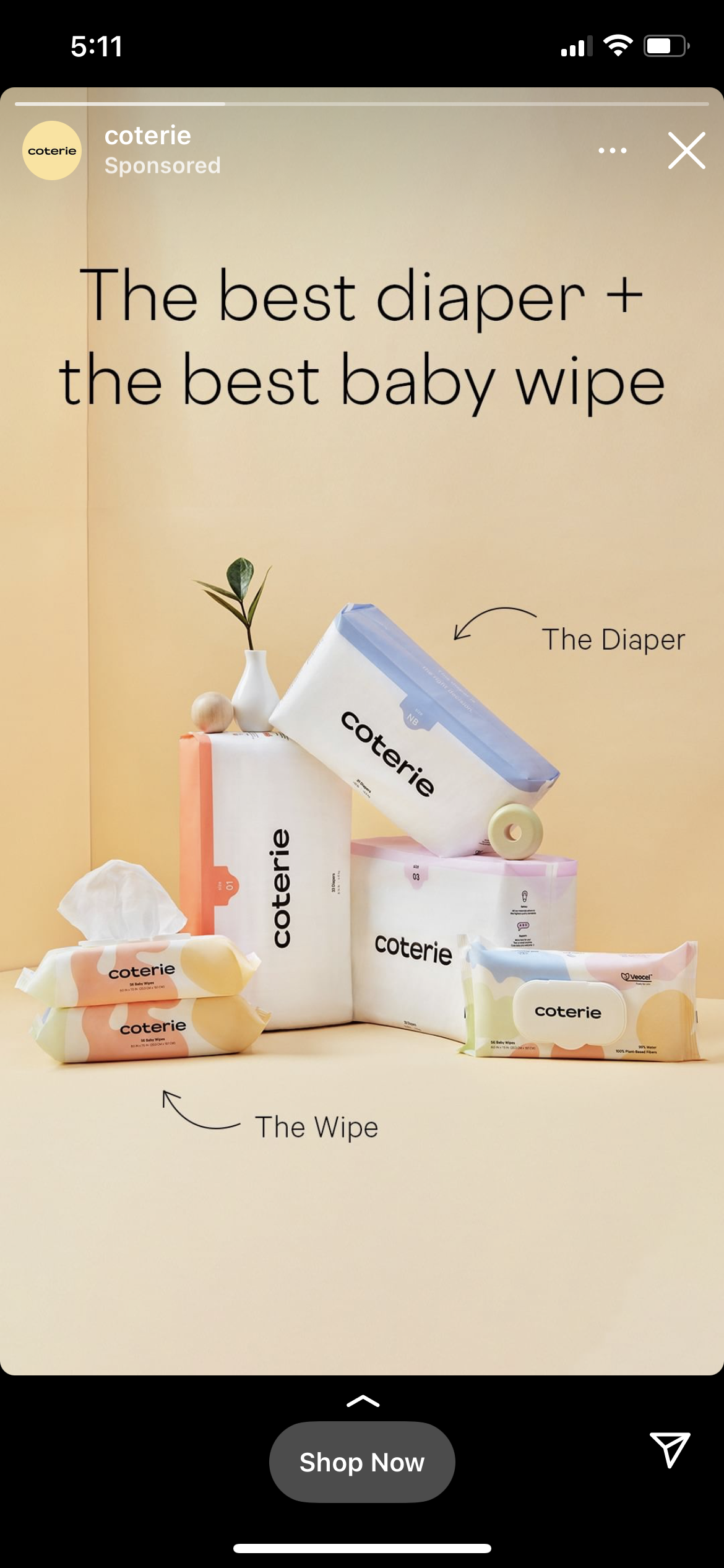
That being said, some text can absolutely work to your benefit. The ad example below from Coterie shows how to leverage just enough text to benefit you without being overwhelming. “Best diaper + best baby wipe” says it all, and they use “diaper” and “wipe” cues with arrows to focus users on the product.
This is also a great example for how to use contrasting colors in a more neutral color scheme, by the way.
3. Drop the Clutter
We’ve all seen Instagram ad designs that are really shooting for the moon and just trying to fit too much into the image. It may be too many products, or a complex gradient that becomes overwhelming on mobile.
Whatever the reason, you want to avoid clutter in your images. Use clean designs and feature just a few products. Remember that you can always feature more in an Instagram ad carousel.
4. Use Central, Interesting Designs to Draw the Eye In
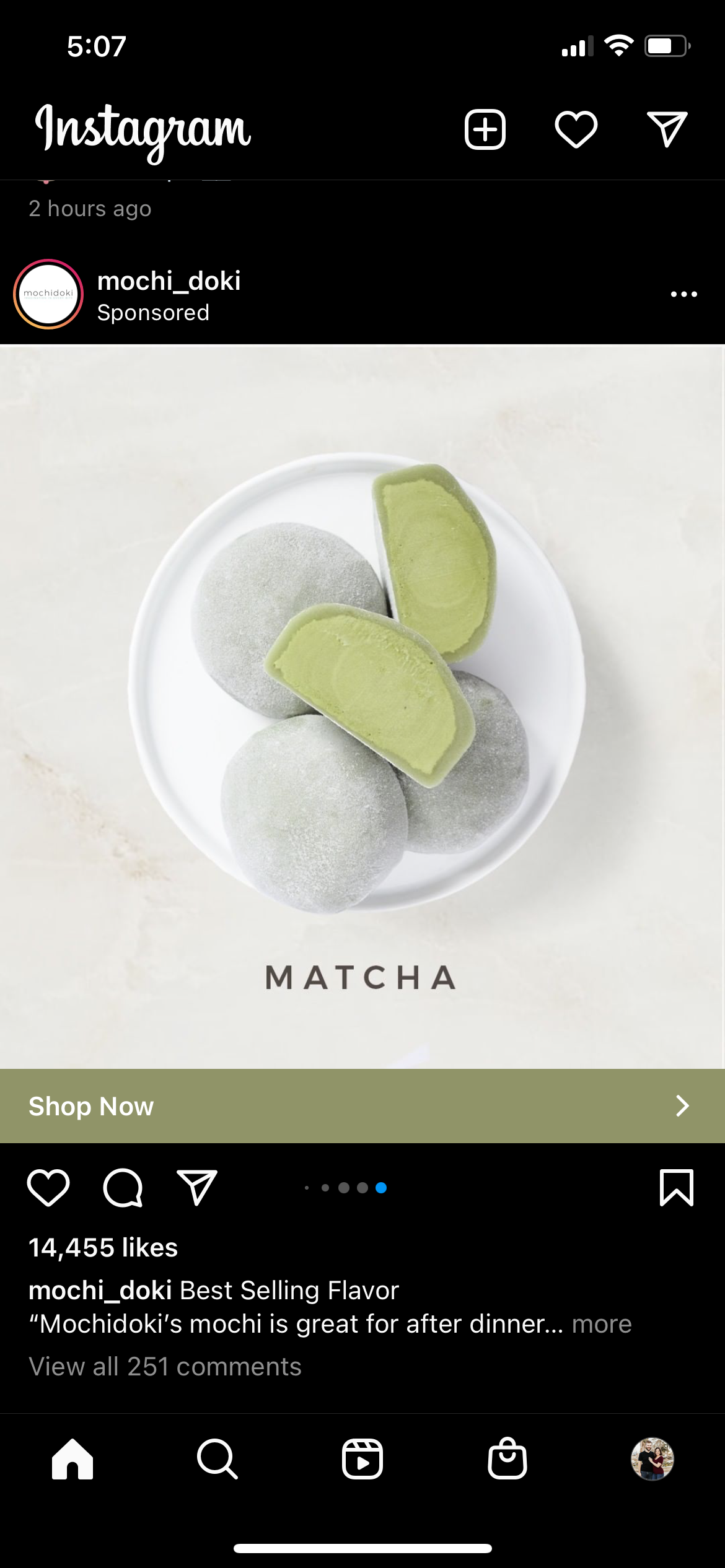
Some Instagram Ads are going to simply be high quality photographs. We’ve already seen one. Others are going to take a graphic-design-centric approach.
No matter the case, know that graphic design posts can benefit from a central design that puts users’ attention on the center of the image, which is where you drop the high value text or design element.
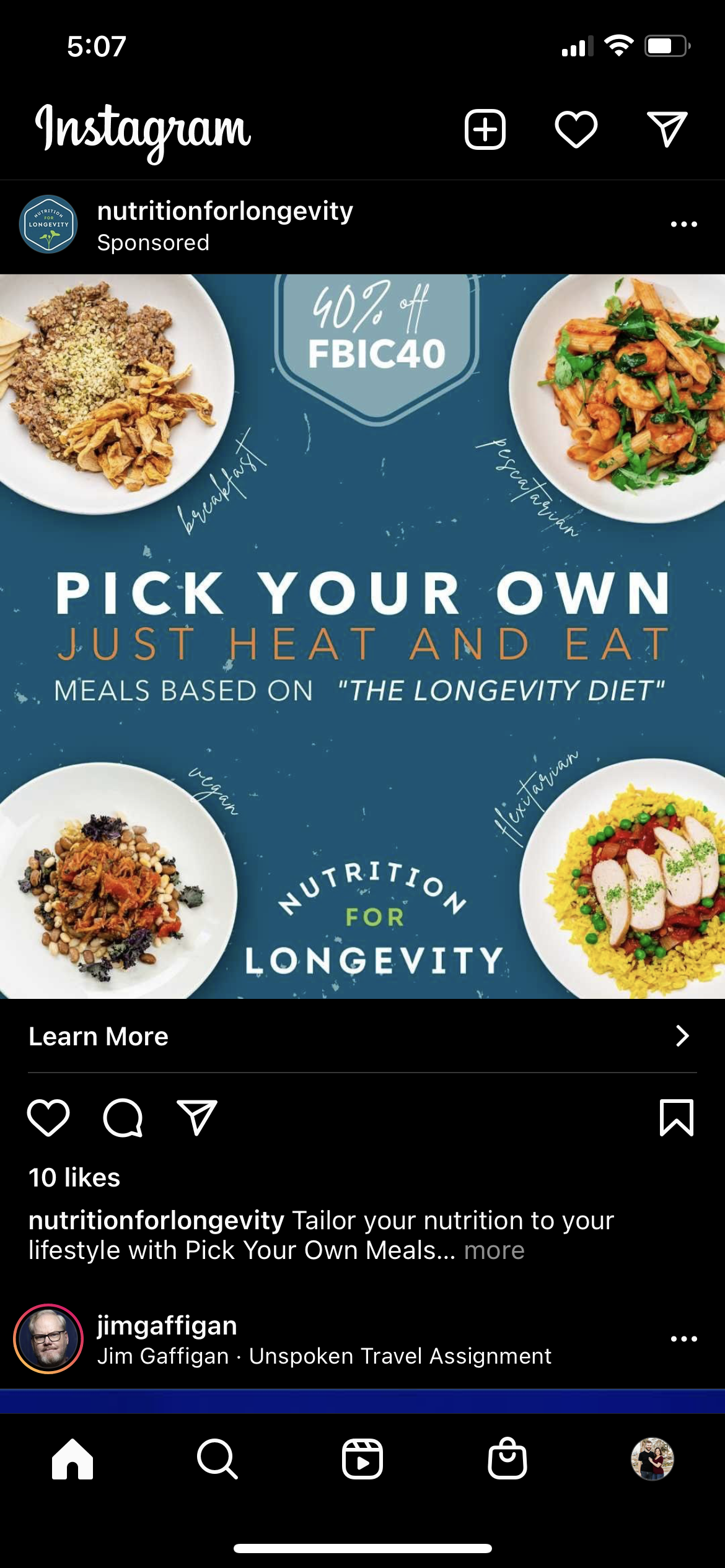
This is easier to show with an example. The ad below is a great one. They feature four different products (increasing the odds of appealing to more people), a discount, and then they feature their USP right in the center.
5. Include Whitespace
Whitespace is going to be part of a decluttered design, but it’s important enough we wanted to have it as its own tip.
Whitespace is also called “negative space.” It’s the relatively blank or neutral areas surrounding the core focus of your image.
There are two reasons why you want to use more whitespace in your images:
- It’s another eye-focusing trick, taking users right to where you want them to look
- It looks cleaner and more polished, which many users associate with professionalism
This is an easy trick to keep in mind when photographing your products or creating designs.
6. Use Branded Colors
Incorporating more branded colors into your ad campaigns is an easy way to start to build brand awareness while creating a strong, branded experience. Bonus points if they are bright, contrasting colors.
7. Consider Color Psychology
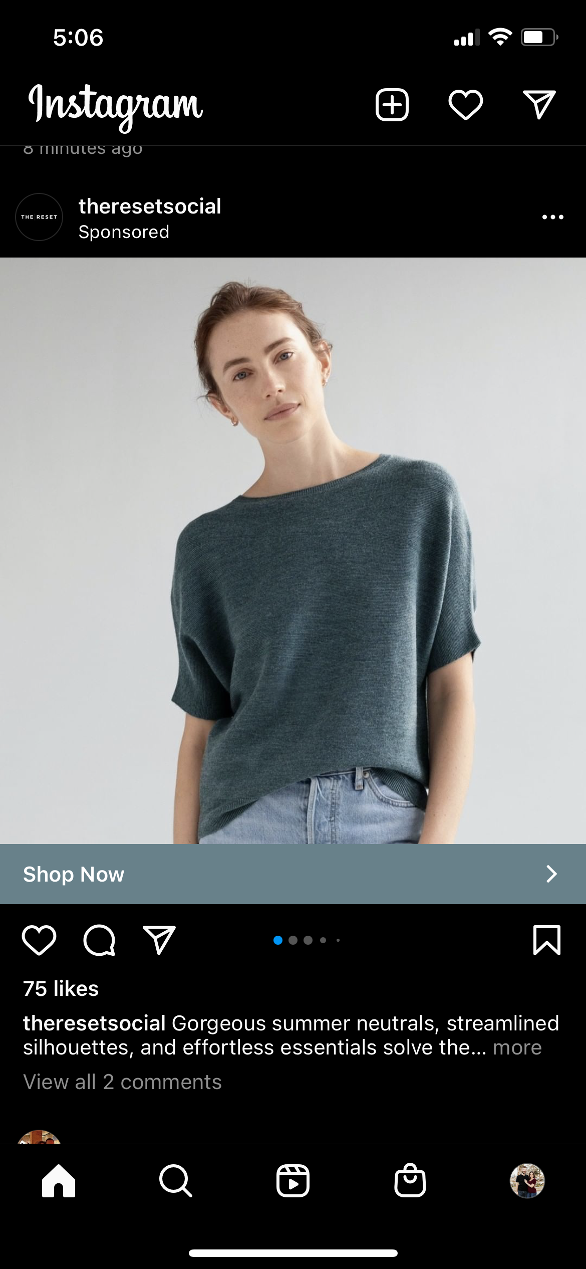
Color psychology is definitely not an exact science, but there’s some truth to it. The colors you choose can set the mood that users feel when associating with the image and the brand. The above example was bright and happy.
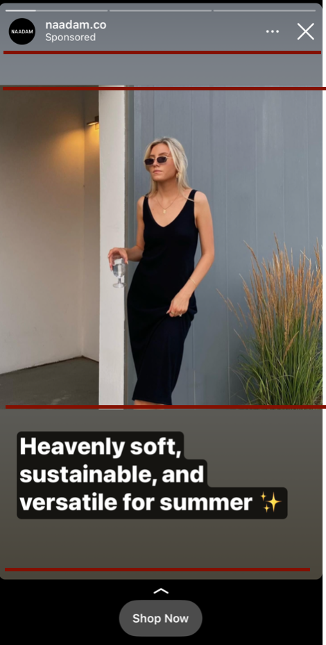
The below ad is neutral, calming, and soothing. This is exactly the sort of mood that the advertiser likely wanted when advertising the clothing.
8. Add Your Logo or Brand Name
People will already see your brand name next to the ad or at the very top of Stories, it never hurts to throw it onto the main image itself, especially for Stories. This can be easier for users to see and take note of than just your profile picture appearing alongside your ad, which is a crucial part of building brand awareness long-term.
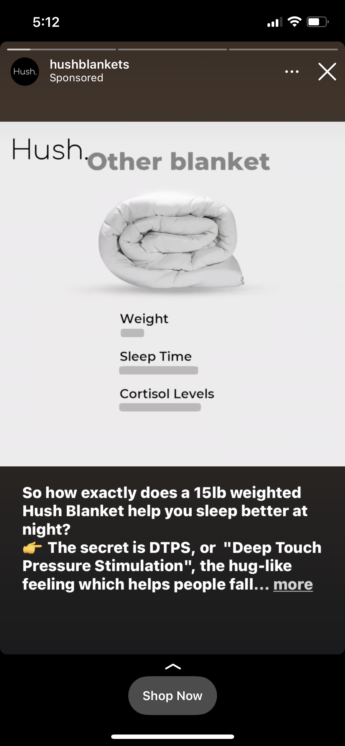
9. Divide Stories Designs Into “Design Section”
If you don’t know how to break up your Instagram Story design in an effective way, here’s a simple trick. You can divide up an image into different horizontal sections, placing an image in one, text in others, and still have a CTA listed.
Here’s how we’d divide up the ad above into different sections. Theoretically, they could have added text above the image between the two red lines and it would have worked well, too.
10. Split Test Your Images
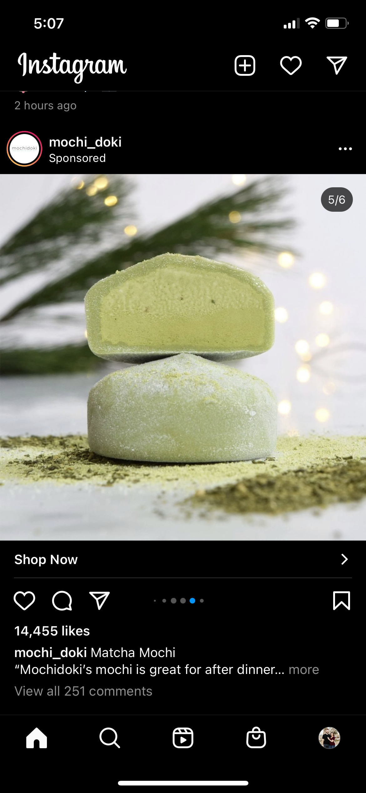
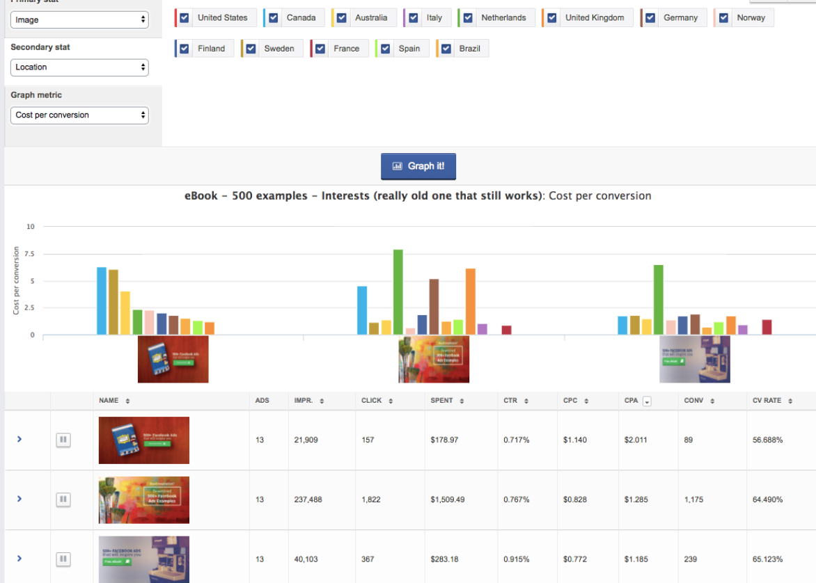
Split testing is a crucial part of ad campaigns, and that goes for your images, too. You need to determine which images your audience responds to best, and since images are such a crucial part of Instagram Ads, you need to test these, too.
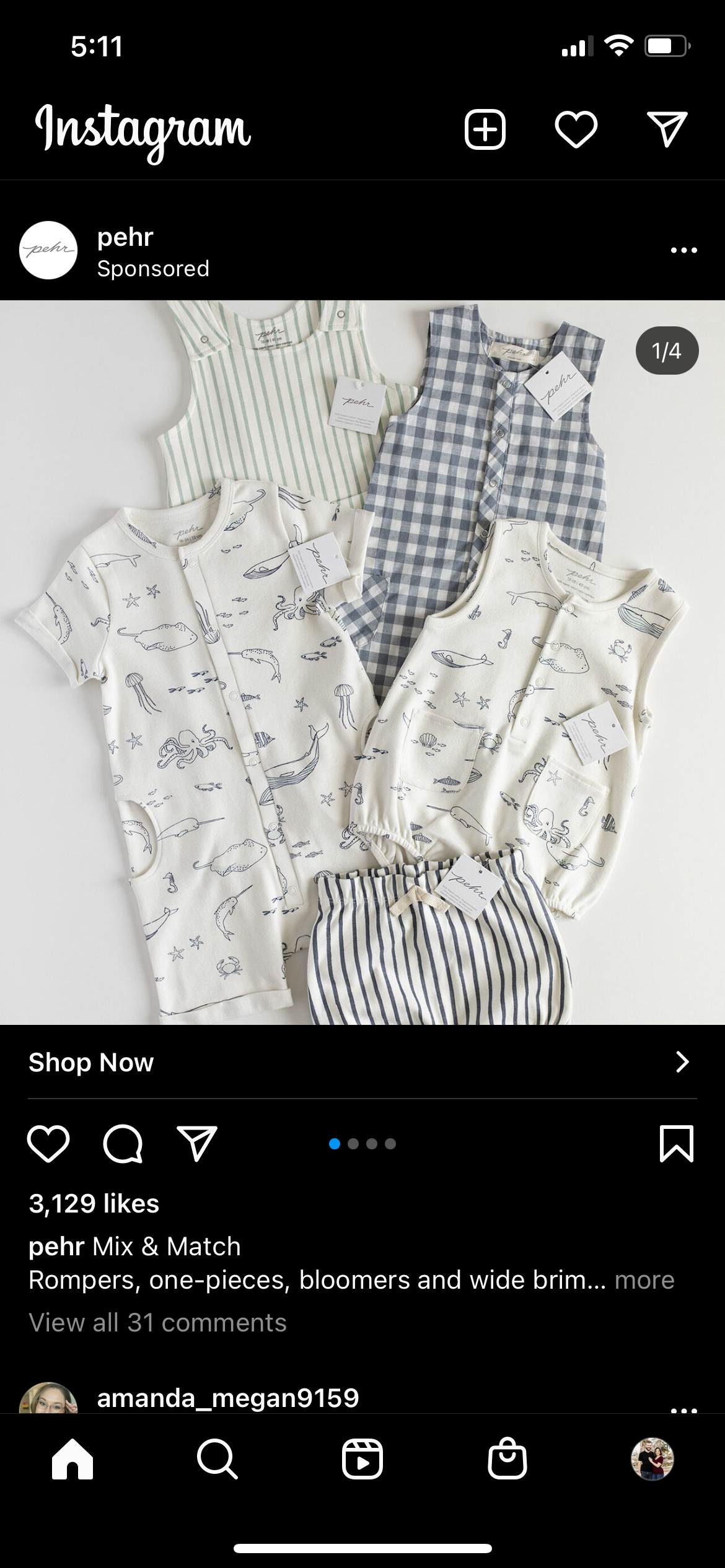
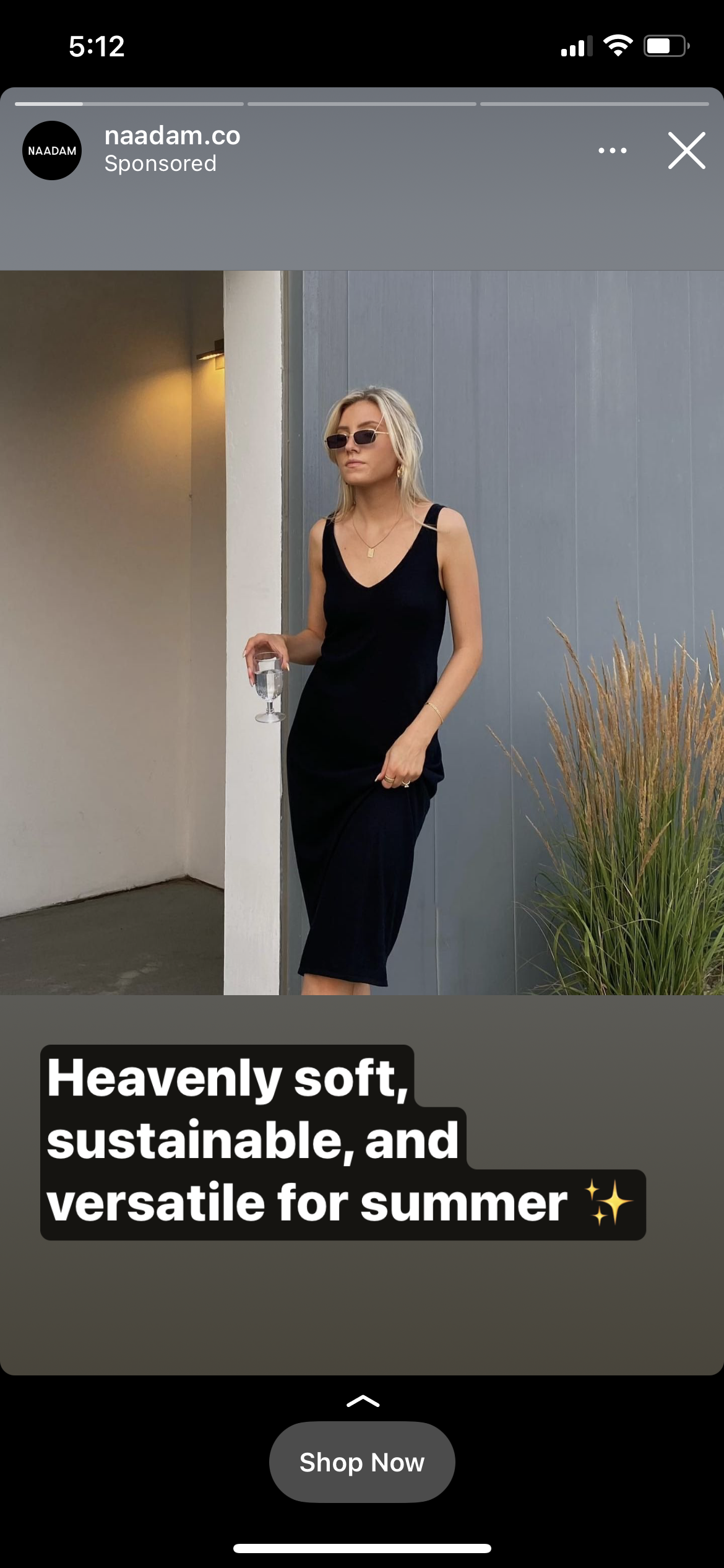
Look at the examples below. Two different images, and they may have two different performances, too.
Instagram Ad Dimensions
When you’re putting together images for Instagram Ads, it’s essential to first know what the correct sizes are before you get started. This makes sure that you’re generating the correct image sizes so there are no issues with cropping.
These are the Instagram Ad dimensions you need to know:
- Single image square ads have an aspect ratio of 1:1 with a recommended image size of 1080 x 1080 pixels
- Instagram carousel ads have an aspect ratio of 1:1 with a recommended image size of 600 x 600 pixels (max 1080 x 1080)
- Landscape ads have an aspect ratio of 1.9:1 with a recommended image size of 1200 x 628 pixels
- Instagram Stories are full-screen vertical ads and have an aspect ratio of 9:16 with a recommended aspectio ratio of 1080 x 1920; the minimum resolution is 600 x 1067
The max file size for these images is 30MB and it’s recommended that you use PNG or JPG files.
Instagram Ad Design Tools
We know you’re probably chomping at the bit to start designing Instagram Ad images at this point, but if you’re still feeling stumped about the thought of needing to learn complicated Photoshop skills, we have great news.
There are so many different great graphic design and editing tools available, and many are available with base plans that are free or extremely low cost, especially compared to the value you get in return. Let’s take a look at some of the best Instagram Ad design tools available to choose from.
Canva
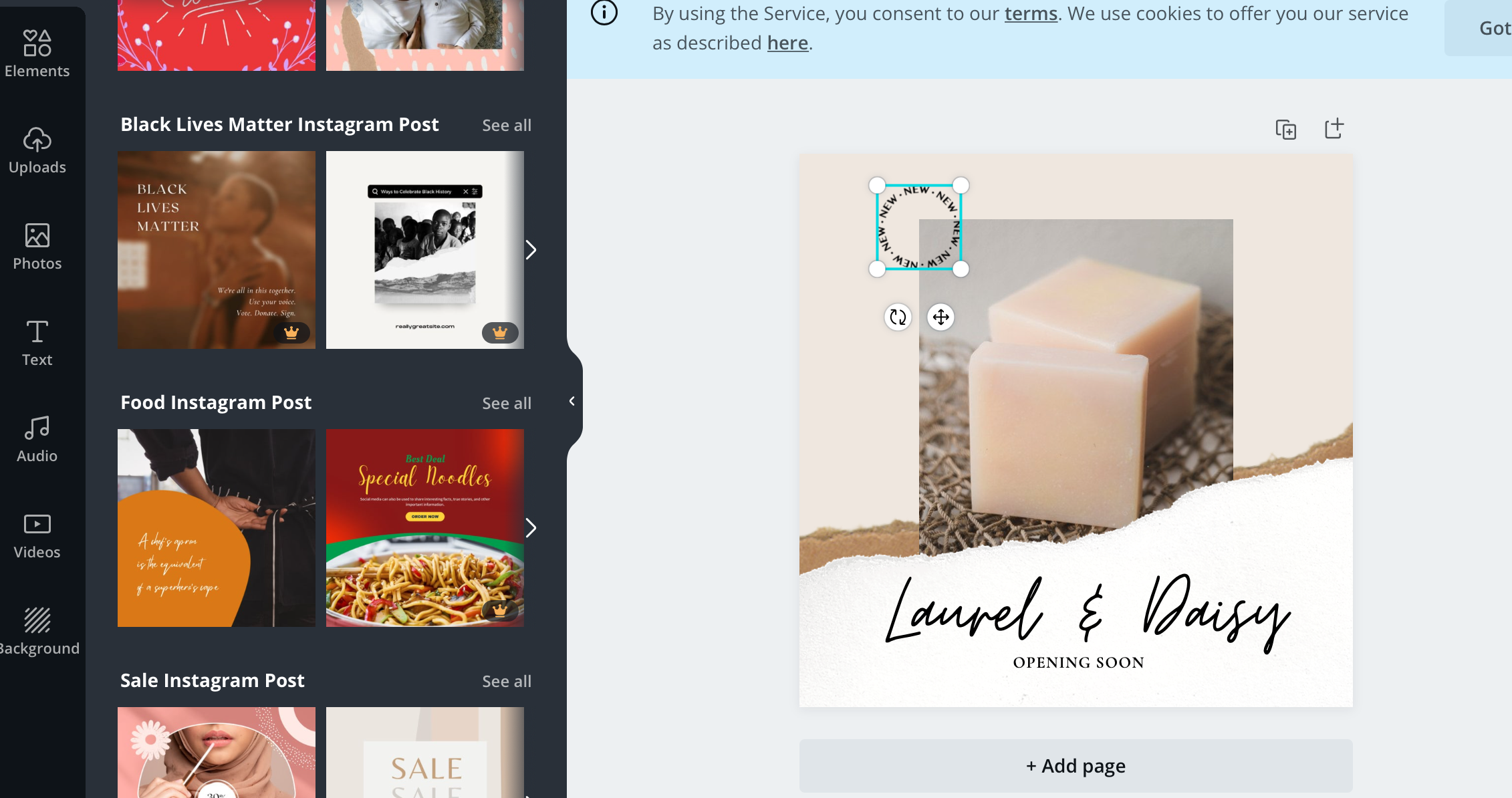
Canva may be the most popular option on this list, and there’s a good reason for that. You’ve got drag-and-drop design tools that are user-friendly, even for people with no design experience. Add text, your logo, design elements, and your images to gorgeous backgrounds or patterns as you wish.
Snappa
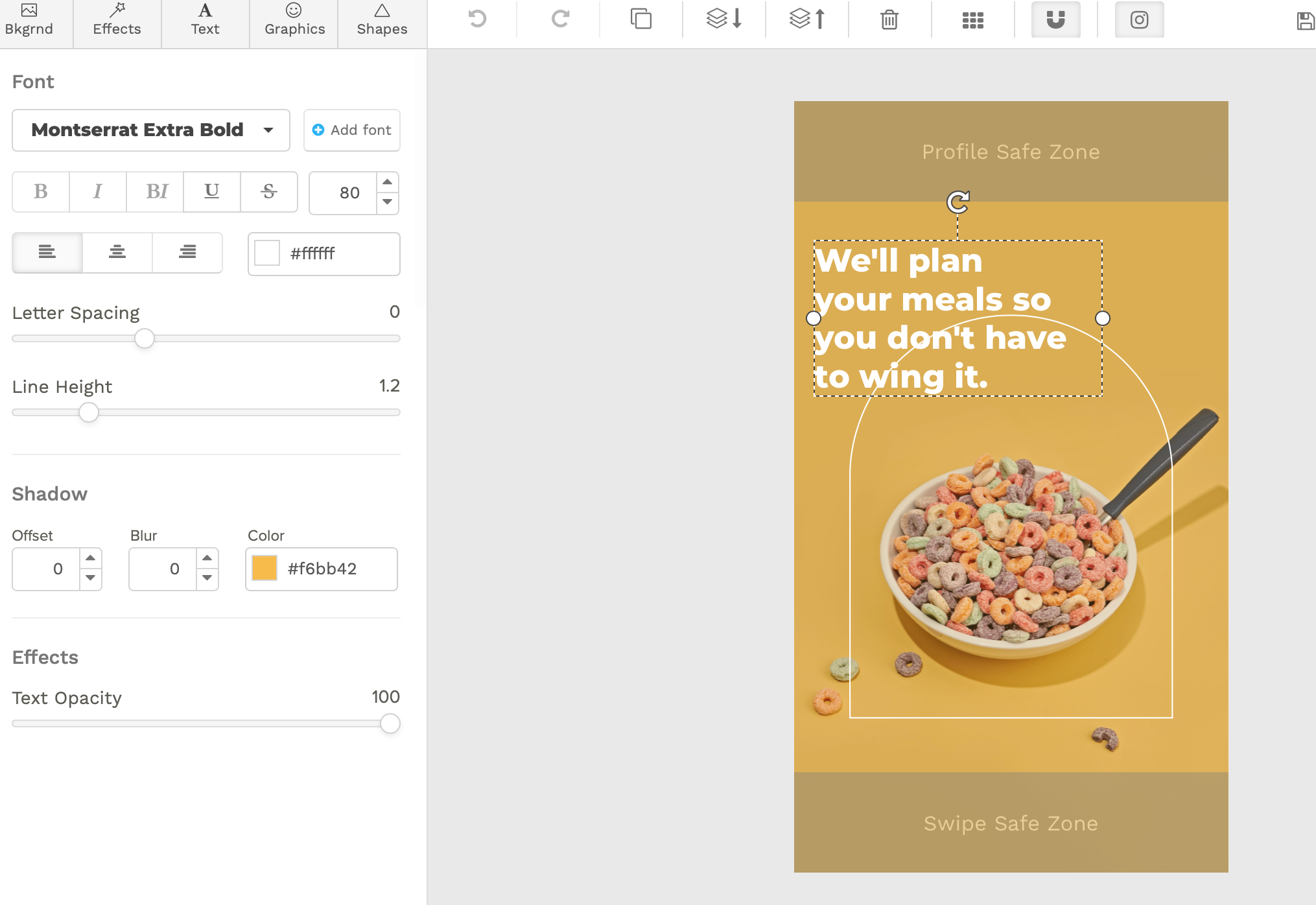
Snappa is a lot like Canva, with a slightly different interface. It’s got all those great templates, a resize feature for if you want to split test whether the landscape versions of an ad perform better than square images, and incredible user-friendliness.
One thing I absolutely love about Snappa is their Stories template. They show you “profile safe zones” where profile information or “click here” buttons may appear. This ensures that you don’t have any crucial design elements that risk being cut off, as you can keep your core Instagram Ad design firmly within areas where they won’t be taken over.
Adobe Spark
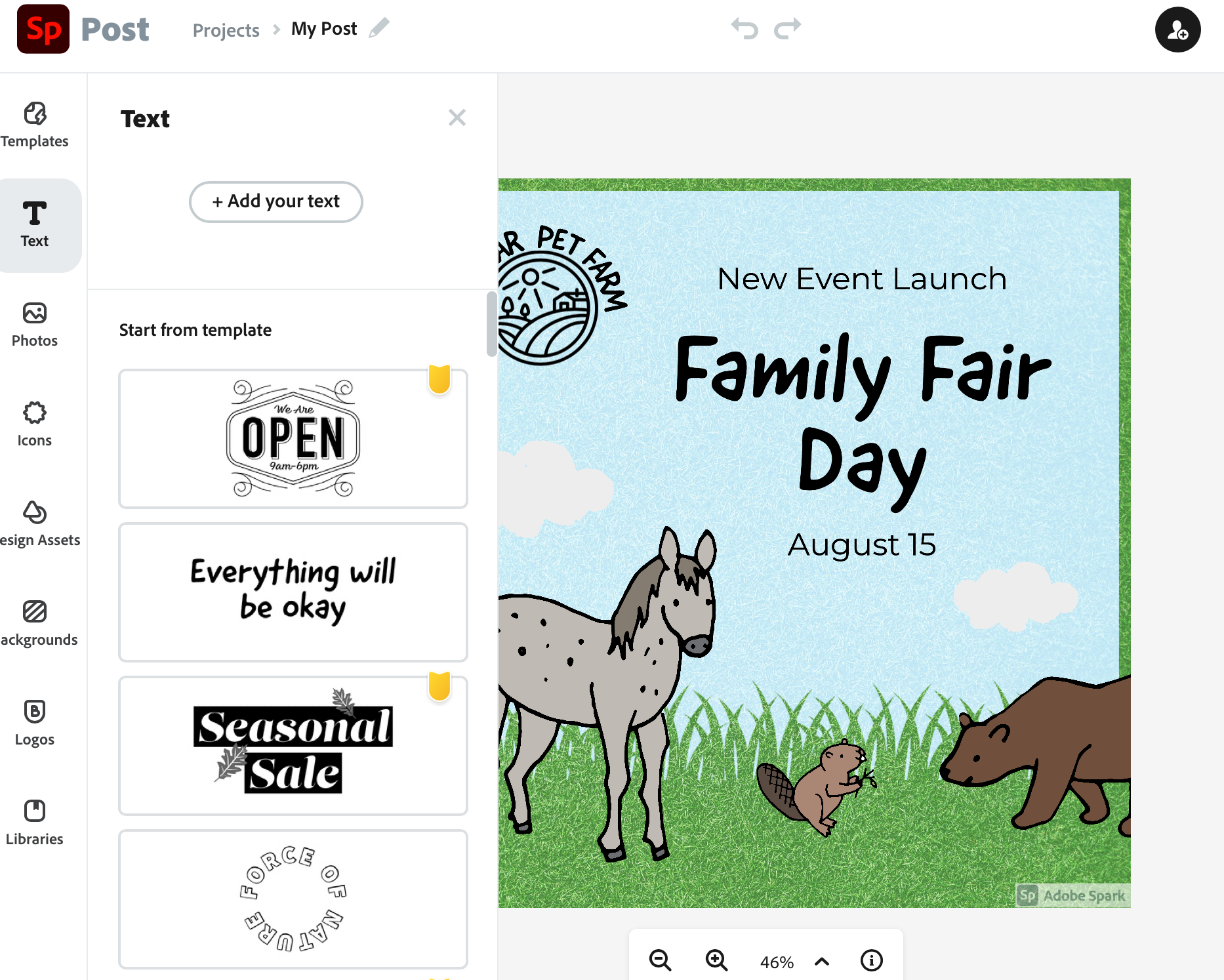
Adobe Spark is a free tool from Adobe that, like the other two, comes with drag-and-drop technology and lots of design options and templates to choose from. This is an especially great tool for brands already working within Adobe. And it’s free. If you’re on a budget you can’t beat that.
AdEspresso
We’ve mentioned the importance of split testing above, and AdEspresso is the tool you want to use when A/B testing your Instagram Ad designs.
Our tool allows you to upload an abundance of images and videos to a single ad, and our software will automatically test to see which combinations of text and images perform best. We’ll optimize your ads accordingly, and you can quickly see which image designs work best for your audience.
You can learn more about how our extensive split testing features work here.
Final Thoughts on Designing Instagram Ads
While the copy of Instagram Ads may seem most intimidating to many, it’s often the images that leave people stumped. High quality photographs can perform well on their own, but even when you’re considering which photos to use, it’s helpful to keep these Instagram Ad design best practices in mind.
While it may take time to find the Instagram Ad designs that work best for you, remember that dedicated split testing over extended periods is the way to go, especially as on-platform trends change and new features emerge.
Want to start split testing your Instagram Ad designs to see which yield the best results? Start your free trial with AdEspresso.
What do you think? Which of these Instagram Ad designs do you use for your business? What design tips and tools are you most excited to try in your next round of ads? Share your thoughts and questions in the comments below!



Leave a Reply