Instagram is one of the best social media — or even digital marketing — channels for promoting your brand. In fact, reports show that 72% of shoppers look on Instagram for their next purchase.
Here’s the thing, though. Even though Instagram is a powerful and effective advertising platform, you’re not very likely to get tangible results from any ad campaign if your ad creatives aren’t visually appealing and if your copy isn’t convincing enough.
To maximize your Instagram ad ROI, you need to create ads that stand out. Luckily, inspiration isn’t hard to find — many brands out there are nailing Instagram advertising.
Below, we breaking down 20 of the best Instagram ads that we could find to inspire your ad creation process.
Instagram photo ad examples
Similar to simple Facebook ads, photo ads are Instagram ads that feature a single image with or without copy. They show up on users’ Instagram feeds, in between organic posts. The effectiveness of image ads depends on the quality of the copy (if you include any), your color palette and what you feature in your visuals, and your call-to-action.
Here are some brands that do Instagram photo ads right.
1. Udemy
Udemy is one of the most popular Massive Open Online Courses (MOOC) platforms in the world. In this ad, the brand is promoting a specific course on cryptocurrency.
What can you learn from this ad?
- Clearly state what your product is about. In the ad copy, Udemy clearly defined what the course is about and the things that people can expect to learn from it.
- Make the offer irresistible. Udemy makes use of phrases like “bestselling course” and “make profits daily” to convince potential learners that the course is worth their time and money.
- Use social proof. In the headline, Udemy states that over 26,000 students have already paid for and taken the course.
- Sweeten the deal. The last sentence in the ad copy says to enroll for a “special offer”, and then goes on to promise a 30-day satisfaction guarantee. This proves that the brand is confident about the quality of the service.
2. Elementor
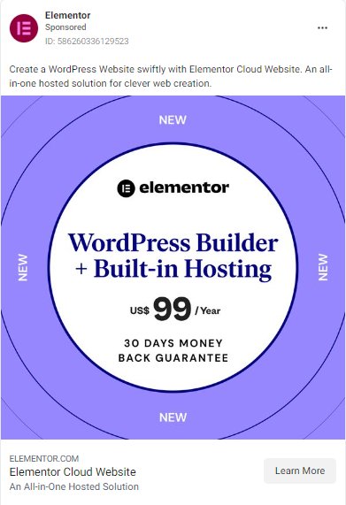
Here, software company Elementor is promoting a brand new service. In this fixed-rate annual plan, they’re offering both a WordPress website builder and built-in web hosting for $99 (which is a steal, if you ask me).
What can you learn from this ad?
- Use bright colors. The lavender color used in this ad is eye-catching and scroll-stopping.
- Go straight to the point. In the copy, the brand used just two short sentences to explain what potential customers will be able to do if they purchase this plan.
- Offer assurance. Just like the Udemy ad, Elementor offers a 30-day money-back guarantee that tells prospects that they can test the service risk-free.
3. Binance
In this ad, Binance, a popular cryptocurrency company, is trying to get more customers to sign up for their platform.
What can you learn from this ad?
- Be creative. Instead of talking about how good their platform is, Binance compared the valuation of Bitcoin a decade ago to its valuation now — and then they asked potential customers to imagine what the next decade holds for Bitcoin.
- Make mouth-watering offers. In the graph, Binance shows just how much Bitcoin has grown in the last 10 years—from a $1 valuation to over $4,000,000. Then they tell potential customers that they have a chance to be a part of this exponential growth if they’d sign up with just $10.
- Use a bold color palette. Binance used its brand colors—black and orange—to design this eye-catching ad.
4. Tecno
In this ad, Tecno is promoting the latest phone in their Spark series, the Spark 9.
What can you learn from this ad?
- Keep it simple. The white background of the ad image is a wise choice because it contrasts with the sharp blue and orange colors of the phone.
- Highlight your product’s main feature. Tecno Spark 9 can do many things most phones can do—text, browse, make calls, etc. But Tecno focused on the main selling point of this phone, which is the powerful selfie camera. They mention the word “selfie” five times in the entire ad.
- Use branded hashtags. The hashtags at the end of the ad copy were created by Tecno to help buyers of the Spark 9 share their experiences with the phone on social media. This way, Tecno can get user feedback, as well as collect user-generated content, which they can use for future ads.
5. Walmart
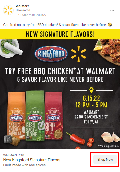
In this ad, Walmart is inviting potential customers to come out and try free BBQ chicken in new flavors at one of their stores.
What can you learn from this ad?
- Be clear about your offers. At the top of the ad image, Walmart clearly states that they’re offering free BBQ chicken in new signature flavors. They also included the time, date, and address that people should visit to take advantage of this offer.
- Color-code your offers. While this might not work for every brand, Walmart did a great job at color-coding the new flavors. When you think of basil, green pops into your head. And chili is obviously red.
- Use bold colors and contrasts. Walmart, like Binance, uses a black background with yellow and red highlights.
Instagram video ad examples
Video ads on Instagram feature either animated or live action videos. The purpose of video ads is to catch and keep the attention of potential customers, and convince them to purchase a product or service.
The most effective video ads are easy to follow, to-the-point, and brand-centric. They should work even without sound. Below are some brands that have mastered the art of using videos in their Instagram ads.
6. Yoga International
Source
In this ad, Yoga International is celebrating the International Day of Yoga by offering customers free live yoga classes with expert teachers.
What can you learn from this ad?
- Be inclusive. This ad appeals to a wide range of yoga enthusiasts because it shows people of different genders, ages, and body types practicing yoga successfully. It sends the message that anyone can join the free yoga class.
- Be flexible. In this ad, Yoga International shows that their classes can be taken anywhere—at home, in an actual yoga class, or out in the open.
- Have a streamlined process. Yoga International only requires people to enter their email addresses to take classes.
You don’t really need potential customers to enter their first name, last name, home address, office number, mobile number, and the name of their last pet to get access to your services. A long process like that will only turn people off.
7. Netflix
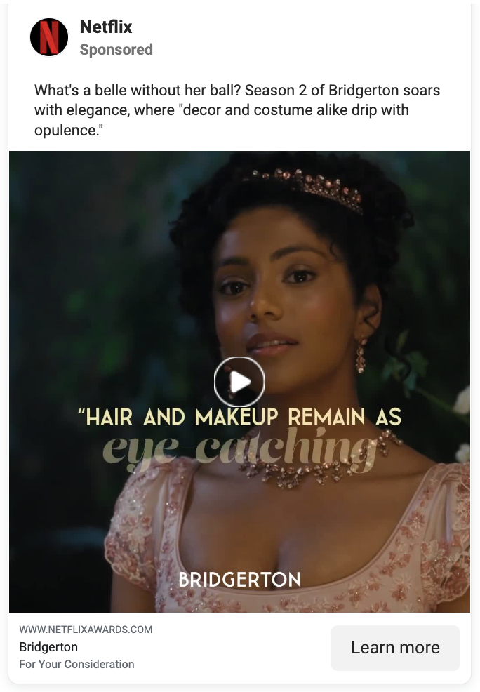
In this ad, Netflix is promoting the show Bridgerton to Netflix subscribers.
What can you learn from this ad?
- Use social proof. Notice all the glowing reviews that reputable critics left for Bridgerton? If that’s not enough to make you want to binge the show, I don’t know what is.
- Include a sneak peek. These reviews were layered over some visually stunning scenes in the show. Netflix included enough scenes in the ad for viewers to be curious about the show, but not enough to know what the show is really about.
8. HubSpot
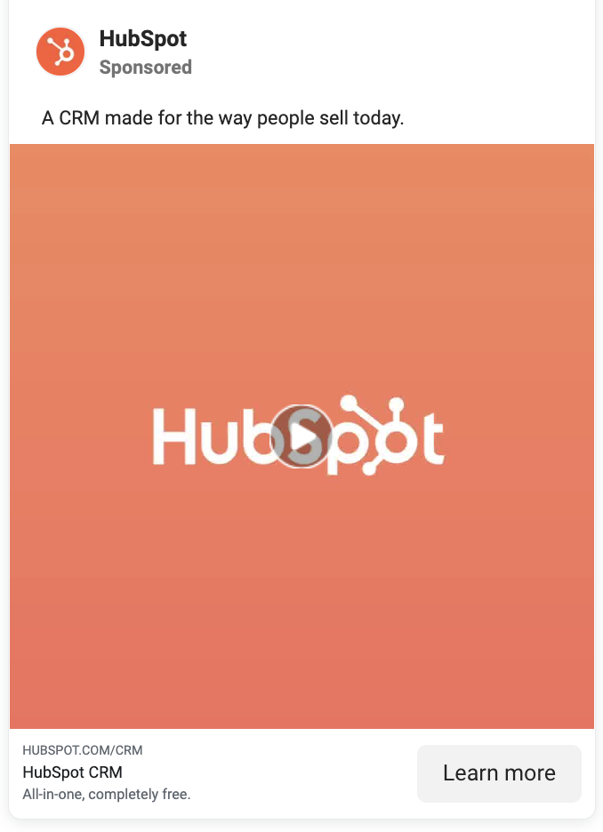
In this ad, HubSpot is trying to get more people to try out their free customer relationship management system (CRM).
- Give people a no-brainer. In this ad, HubSpot gives people two options—spend hours manually entering data into a spreadsheet OR signup for their free CRM. The second option is a no-brainer because it will save the user a lot of time (also, who likes spreadsheets?).
- Show (and tell). In this ad, HubSpot doesn’t just tell people that using spreadsheets will waste their time and efforts or that their CRM will make things easier. It actually shows them. In the background of the ad, HubSpot shows a video of how hectic it is to enter names and numbers into each spreadsheet cell. Then, they create a contrast by showing people how easy it is to input data into their CRM.
- Give people a guarantee. If you’re running ads, you need to be straight with prospects on what you’re offering. For HubSpot, it’s their CRM, which is 100% free. Forever.
Instagram carousel ad examples
An Instagram carousel is a post that contains more than one image or video. These ads show up on users’ feeds, between organic posts. People can view carousel posts on the mobile app by swiping left. On desktop, however, you have to click the arrow button on the right side of the post.
Carousel ads are used on Instagram to promote multiple products that cannot be featured in a single image. Each slide of an Instagram carousel ad can have its own headline and CTA. Some brands also use carousel ads to showcase many features, details, or qualities of a single product or service.
Here’s how these brands use carousel ads to market their products.
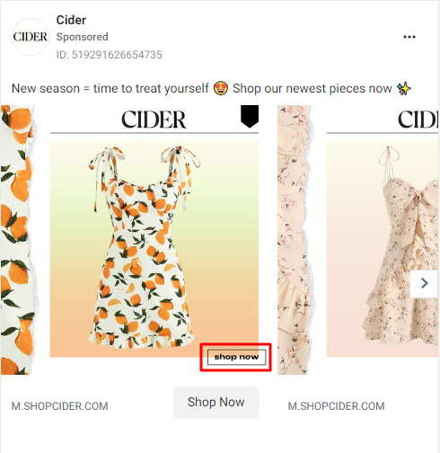
9. Cider
Here, online fashion store Cider is promoting their newly launched summer clothing line.
What can you learn from this ad?
- Show details. In each slide, Cider shows a closeup of each garment’s fabric, as well as a full product picture so that people will know what to expect when they buy a dress.
- Use warm colors. Notice how the white-and-orange dress has an ombre-light orange background? And the peach dress has a lighter peach-colored background?
While contrasting colors help ads stand out, the clever use of warm colors also has a visually pleasing effect.
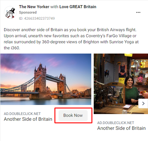
10. The New Yorker
In this ad, The New Yorker is trying to get people to book tickets for a British Airways flight.
What can you learn from this ad?
- Fuel anticipation. In this ad, The New Yorker mentions some remarkable places that people can visit if they fly with the British Airways flight. This gives them something to look forward to when they pick their flight.
- Use high-resolution images. Look at the picture of the London Bridge in this ad. Doesn’t that look like a place you’d want to visit? Not only do high-resolution images show that you’re professional, they can also pique the interest and curiosity of potential customers.
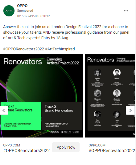
11. Oppo
In this ad, Oppo is trying to get the public to join them at the London Design Festival 2022.
What can you learn from this ad?
- Be clear about your offer. Oppo’s ad copy clearly states that people will get a chance to show off their talents and get advice from art and tech experts. In your ad copy, let people know exactly what you’re offering.
- Organize your information. While planning carousel ads, you have to know what information would go on what slide. Oppo does a great job of segmenting the information about the Festival. The first slide is pretty simple—it gives a glimpse into what customers expect at the Festival. The second, however, goes more in-depth and shows the experts who would be dishing out advice to attendees.
- Use branded hashtags. Like the Tecno ad above, Oppo also created two branded hashtags that will enable people to share the ads across major social media platforms.
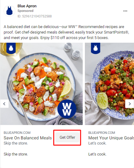
12. Blue Apron
In this ad, Blue Apron is offering to deliver chef-cooked balanced meals to the doorstep of people who purchase their service.
What can you learn from this ad?
- Use scroll-stopping images. Be honest: the first thing that caught your eye about this ad was the food. Yes or yes? In this carousel ad, Blue Apron used images of four different foods that they can cook and deliver to people who sign up. Your ad images should not only be high-resolution, they should also be attractive.
- Offer great discounts. If you’re going to be using discounts as a way to get people on board, offer tangible discounts. Here, Blue Apron is offering $110 off for 5 boxes of chef-prepared meals. That’s no joke, especially when you consider how much groceries cost and the time you’ll spend to put it all together.
- Use definitive language. Speaking of groceries, Blue Apron uses definitive lines like “skip the store,” “meet your goals,” and “save on balanced meals” to show people the value of their offer. As you write your ad copy, try to succinctly and confidently communicate the value of your product/service to prospects. Be careful not to overpromise, though. That’s counterproductive.
Instagram Story ad examples
Instagram Stories ads are located on the top of every Instagram user’s feed, alongside organic Stories. Stories and Stories ads are basically short videos or images that display vertically and fit the full mobile screen for a better user experience. Story ads look very similar to organic Stories and play in between them.
The brands below know how to use Stories ads to reach potential customers.
13. Headway
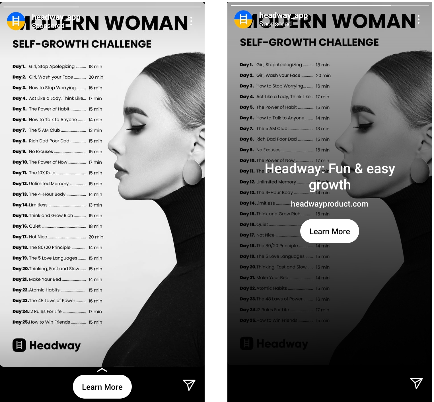
The Headway app helps you boost your knowledge through fun, accessible insights, games, and activities. In this Story ad, they are highlighting the app’s ability to compress books from the world’s greatest minds into bite-sized lessons that people can consume on the go.
What can you learn from this ad?
- Think outside the box. In this ad, Headway tries to get the attention of people who actively want to increase their knowledge. But instead of explaining how Headway breaks down 300-page books into tiny, value-packed insights, they’re challenging people to read 25 books in 25 days with the app.
- Make your offers believable. While your offers should be unique to get people curious, they should also be believable if you want people to click your CTA. Most people know that it’s nearly impossible to read 25 self-help and business books in 25 days, but Headway shows that they only need about 20 mins each day to learn the key takeaways of each book.
- Try black-and-white hues. If you don’t want to use bold colors for your ads, then you can try black-and-white images. The black-and-white image and background Headway used is swipe-stopping because it gives a different vibe from the many bright colors you see on other Stories.
14. Zurella
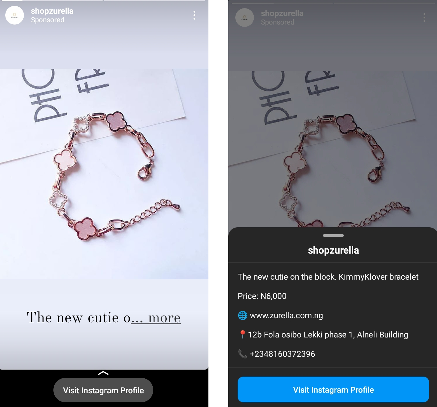
In this Story ad, Zurella is promoting their beautiful new bracelet called the KimmyKlover bracelet.
What can you learn from this ad?
- Be product-centric. Sometimes, you need to let go of the bells and whistles and just let your product shine. That’s what Zurella did in this ad. There’s nothing in the ad that will pull a viewer’s attention from the pink bracelet. The neutral background helped the bracelet stand out.
- Let customers know how to reach you. In the description, Zurella provided all the information potential customers need to buy the product or get in touch for questions or complaints—the name of product, price, website address, store address, and phone number. Making your contact information accessible to potential customers will not only save time and effort on both sides, but it will also improve customer experience. It can even get you some repeat customers.
15. Oh So Little
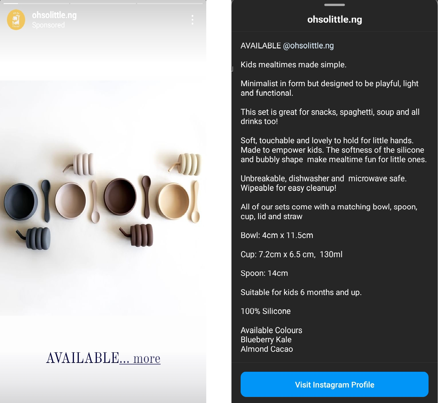
In this ad, Oh So Little, an online baby store, is promoting bowls for baby meals.
What can you learn from this ad?
- Focus on your product. Like Zurella, sometimes you just have to let your product speak for itself. Notice how there are no gimmicks, doodles, or animated cartoons in this ad, as is common with baby-themed ads.
- Neutral colors work, too. Bold colors and complementary colors are effective at catching people’s attention. But there’s something magnetic about simple, neutral colors in an ad. The brown and black shades of the bowls contrast very well with the neutral background.
- Describe your products. In their Story ad copy, Oh So Little adequately describes their products succinctly. They talk about the purpose of the bowls, their texture, their selling points, their specifications, their target audience, and the available colors.
16. Kaplan Pathways
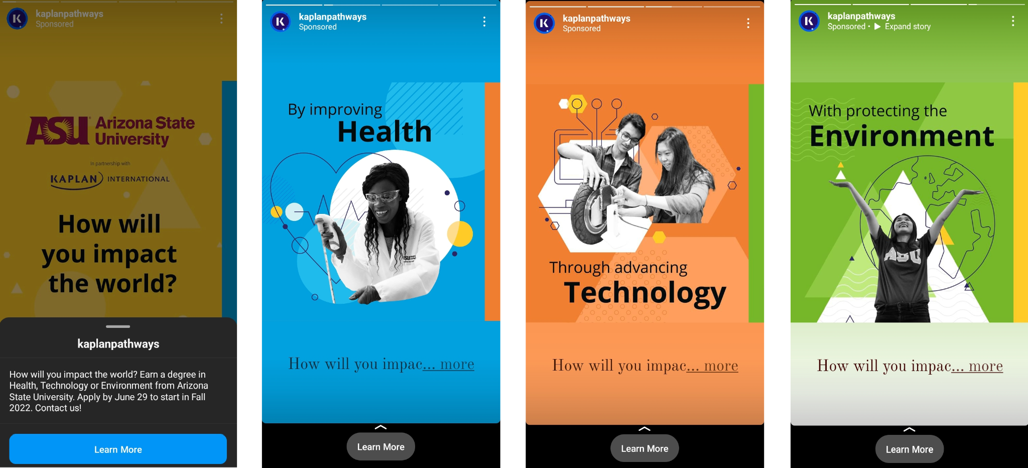
In this ad, Kaplan Pathways partnered with Arizona State University to promote their degrees in Health, Technology, and Environment.
What can you learn from this ad?
- Ask a thoughtful question. Applying for a university degree is no joke. A degree takes years to complete so people have to think deeply about whether it’s worth it or not. To get a potential student to see the value of the degree, Kaplan Pathways asks a deep question: How will you impact the world?
- Match your visuals and ad copy. The last three slides of this Story ad provide some degree-related answers to the question posed in the first slide. Check out the way Kaplan Pathways put images of a medical professional, engineers, and an environmentalist in the appropriate slides. Even the illustrations are related to the degree that is talked about in each slide.
Instagram sponsored post examples
All ads on Instagram have the “Sponsored” tag on them. This tag shows that the company is paying Instagram to push the posts to new audiences.
Below are some great examples of Instagram sponsored posts:
17. MasterClass
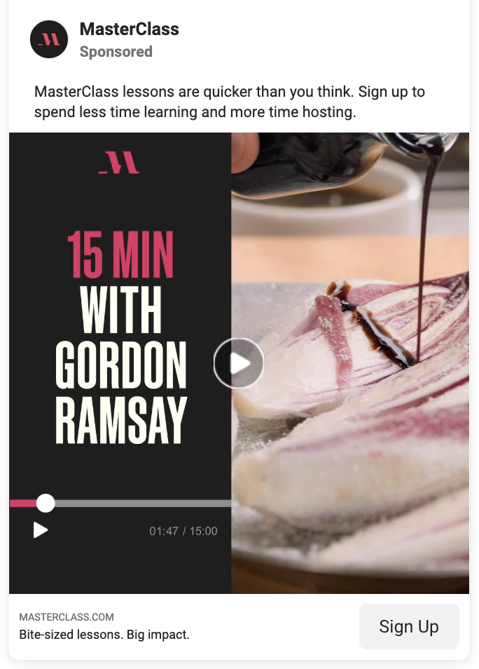
MasterClass is an online learning platform that sells courses created by celebrities, influencers, and subject matter experts. In this sponsored post, MasterClass is promoting a cooking course presented by celebrity chef, Gordon Ramsay.
What can you learn from this ad?
- Take down common myths. The first line in the ad copy says, “MasterClass lessons are quicker than you think.” When people hear the word “lesson”, they usually think of boring, hour-long videos. MasterClass dispels this myth by telling people that their lessons are much quicker. In the video itself, MasterClass shows that this lesson will last only 15 minutes.
- Give a sneak peek. MasterClass gives people a sneak peek into what the lesson would look like by showing short clips of Gordon cooking some sumptuous-looking meals. Give people a small glimpse into the product/service you’re trying to promote.
- Be an expert. MasterClass has courses hosted by reputable people like Serena Williams, Roxanne Gay, Alicia Keys, etc. I mean, who can teach you tennis better than Serena Williams, amirite? You don’t need to have such high-profile people backing your business, though. You just need to be an expert in your field so that people can trust you.
18. Uber
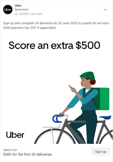
In this ad, uber is telling people that it will give them an extra amount of money if they sign up and complete 30 deliveries.
What can you learn from this ad?
- Make your incentive the center of your ad. Notice how the visual just has the incentive on it and no other copy. “Score an extra $500”. That’s the message. Simple and clear.
- Use a white background. If you’re not a fan of colored backgrounds, use a white background. All colors pop against a plain background.
- Give an ultimatum. If it fits, set a date or time when your offer expires. In this ad, the deadline is June 30th 2022. Uber is likely going to see a significant increase in signups before that date.
19. Wix
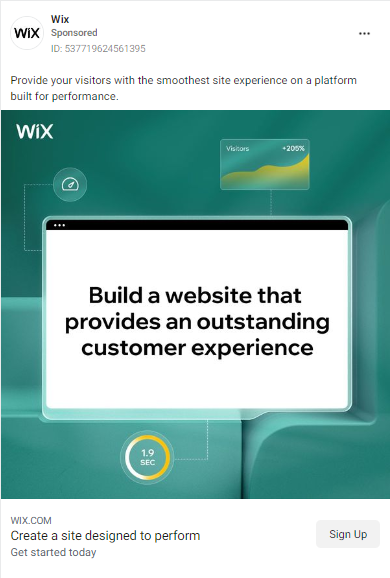
In this ad, Wix is trying to get people to use their platform to create websites.
What can you learn from this ad?
- Make your value proposition clear. Wix makes it clear in this ad that, if people sign up, they’ll be able to get “the smoothest site experience” and “provide an outstanding customer experience.” As you make ads, try to highlight the benefits of your product/service as it relates to your users’ problems.
20. Glossier
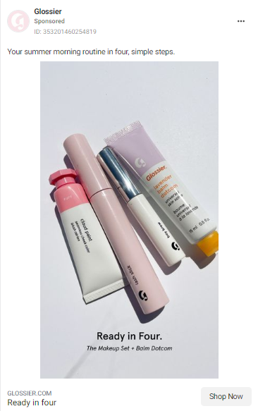
In this ad, Glossier is promoting their beauty products—a lip balm, brow stick, lash tube, and blush.
What can you learn from this ad?
- Make things simple. In this ad, Glossier uses words/phrases like “simple” and “ready in four” to convince people that all they need to get ready for the summer are these four products—and nothing else. Easy peasy.
- Be concise. The caption of this ad is only eight words long and yet, it communicates the value of Glossier’s summer beauty products perfectly.
Make Instagram advertising work for you
While each of these ads has its own unique winning characteristics, great Instagram ads share some common elements you can incorporate into the next ads you create.
These include:
- Use complementary or bold colors to draw attention. (But if you want to keep things chic and simple, a neutral palette would do just fine — as long as it’s consistent with your overall aesthetic and will be easily recognized by your audience as yours.)
- Keep your copy, brief and to the point. Highlight your unique selling point.
- Focus on your product. It’s good to flex your design skills, but at the end of the day, your product should be the star of the show.
- If you’re making video ads, present your product as flexible and easy-to-use. If possible, use user-generated content.
With this list of the best Instagram ad examples, you have the best source of inspiration for creating scroll-stopping Instagram ads that drive leads and conversions for your company.





This was absolutely amazing and useful thank you
Yeah but make sure that The quality of the design and colors used to attract the user are the most important factors for the success of the advertising campaign. You can check me on fiverr I may help you
Your blog is very nice… Thanks for sharing your information…
Great post! Love these ads. Wanted to drop my $0.02, if I may…
I spend a lot of time scouring Facebook and Instagram, gathering examples of popular ad themes and formats for our clients.
With Facebook now allowing you to view active ads for Facebook brands (you can go to any Facebook business page and click “Info and ads”), it’s much easier to collect inspiration from competitors & brands that have a large Facebook/Instagram presence.
As you plan your company’s creative roadmap, it’s imperative that you keep the inspiration flowing.
We actually wrote a similar article with ads to steal, if you’d like to check it out: https://bit.ly/2NpsNuI
Hope that helps! See ya
I’m pretty sure that FB disallows before/after ads – especially in the weight loss industry – on the FB platform. What gives with that first ad? Are things that different on IG?
Great Post Helps in understanding the quality of the design required in instagram ads.
I really do think that Instagram ads are a perfect suit for B2C brands who leverage stories and fun emotional content. And yes Instagram is one platform which has a lot of millennials.
Nice, thanks for sharing, adding to my favorites 😉