Ads on LinkedIn can pay off big time. LinkedIn is the most trusted social media platform, and marketing there can lend your brand credibility by proxy. It’s an excellent platform to build your brand, post jobs, or promote your events.
Coming up with good ad creatives is not easy. People on social media have developed “ad blindness” in recent years. They simply scroll past ads. But you still need to produce a great ROAS that your boss will be happy with. No pressure, right?
Here’s your lifesaver! In this roundup of LinkedIn ad examples, you’ll find a handful of creative ads you can get inspired by for your next campaign.
Let’s jump in!
LinkedIn ad examples (and why they work)
29% of marketing professionals say that sponsored posts work best on LinkedIn.
Sponsored posts could be anything from image ads, to carousel ads, or even job ads. In the following sections, you can review a few different styles that use unique approaches to capture the attention of a LinkedIn audience.
LinkedIn sponsored content ad examples
1. Intel Corporation
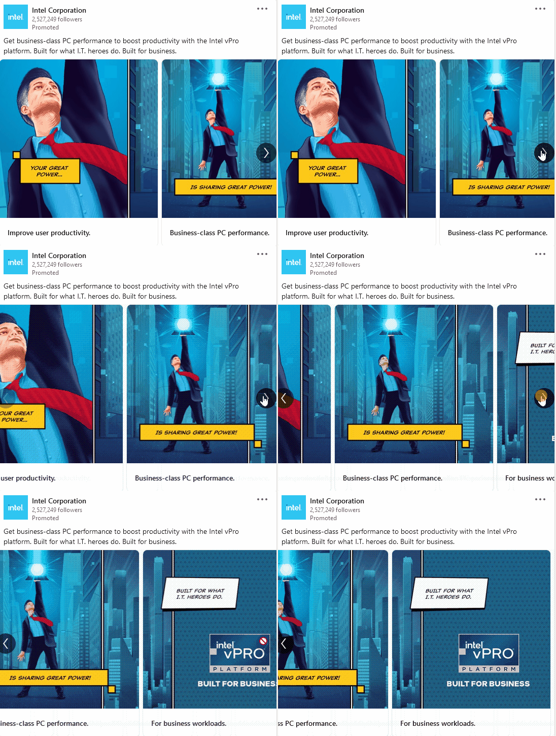
This LinkedIn ad example is a sponsored content ad with a carousel. These are one of the best ad formats for those just starting up with LinkedIn for their business.
Why does this ad work? Carousels are the second most clicked through ad formats after the single image type ads. If you want to generate more engagement, a carousel ad could be a great way to stop people from scrolling over to the next piece of content.
The comic strip-like carousel used by Intel would catch the eye of any user, let alone their target audience, which consists of IT professionals. The ad copy does a good job in understanding the audience and listing the benefits of the product (see: “business-class PC,” and “boost productivity”).
Source: Intel LinkedIn ads
Takeaways:
- Who said LinkedIn ad creatives must consist of stock photos of professionals in meeting rooms? Try using new, trendy design styles that offer something different to users.
- Investigate what your target market likes with customer surveys, Google Analytics, or your own reviews. Use visual storytelling to channel your messaging around their preferences.
- Don’t forget to build your ad around an objective. Are you looking to increase brand awareness? Or do you have a new product launch? Set up your ad to revolve around a single theme.
2. Airbnb
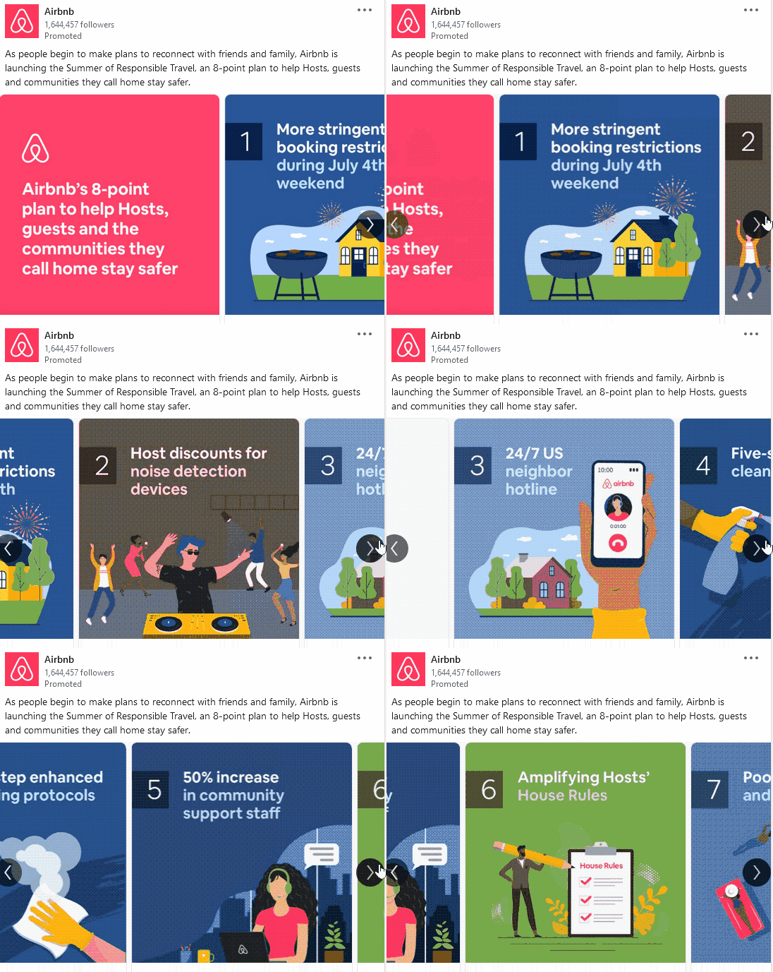
The next LinkedIn ad example comes to you from Airbnb.
32% of users nowadays need six or more touchpoints to make a purchase decision. Airbnb knows this. This carousel ad focuses mostly on brand awareness by offering some post-COVID tips.
Source: Airbnb LinkedIn ads
Takeaways:
Complement your marketing strategy with one or two value-packed engagement ads. Pick a theme that makes sense for your business and create a series of tips for your audience. For example, if you have a flower store, you can offer spring planting tips in your carousel.
- Don’t shy away from using vibrant colors (as long as they make sense for your business).
- Keep the word count at 10 words per slide or less.
- Add a final slide that drives traffic to a landing page (such as a blog or a product listing page).
LinkedIn video ad examples
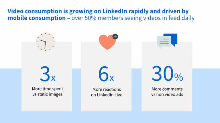
Out of all the ad formats on the platform, LinkedIn video ads are especially efficient in driving engagement. To combat ad fatigue and stand out on feeds, many marketers like to switch up their regular image ads and throw in some videos, too. And this tactic is paying off:
Source: The B2B House
Let’s take a look at two examples below.
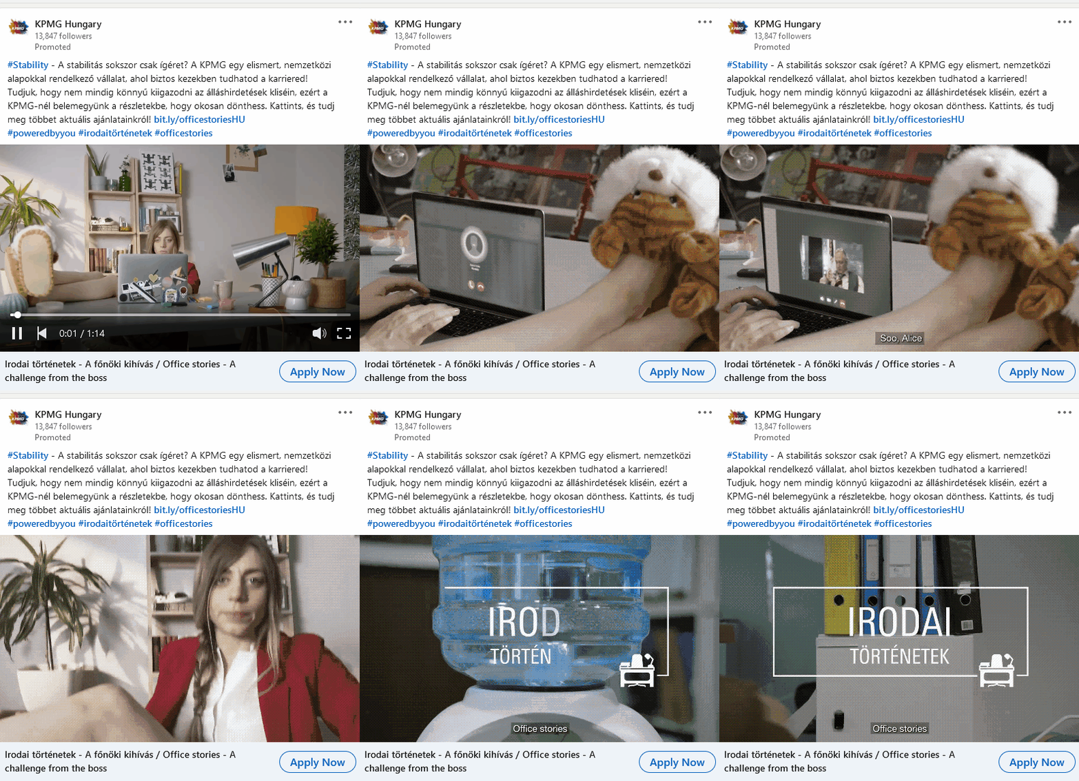
3. KPMG Hungary
Hungry for outside-the-box ad creatives? This ad may be it. No, it’s not an English-language video. Still, the creative stands out on the main feed. The ad feels like an episode from The Office, and LinkedIn has just the right audience to appreciate the nod.
The story is about an intern who is receiving her first month’s evaluation from her boss. The boss gets a phone call and excuses himself to take it. He thinks he mutes himself but, unknowingly to him, he misclicks on his computer. Then, the intern gets to listen to him laugh about the fact that she will soon be canned, and the business is about to go belly up, too. The segment ends with a message about choosing a reliable company to work for.
Source: KPMG Hungary LinkedIn ads
Takeaways:
- Use storytelling or even skits to captivate your audiences.
- If you can, feature your co-workers for added brand authenticity.
- Connect the story to a call-to-action that brings home the message (in this case, KPMG is making a point about being a reliable employer).
- Make your video ad 1-2 minutes at most.
4. Vidyard
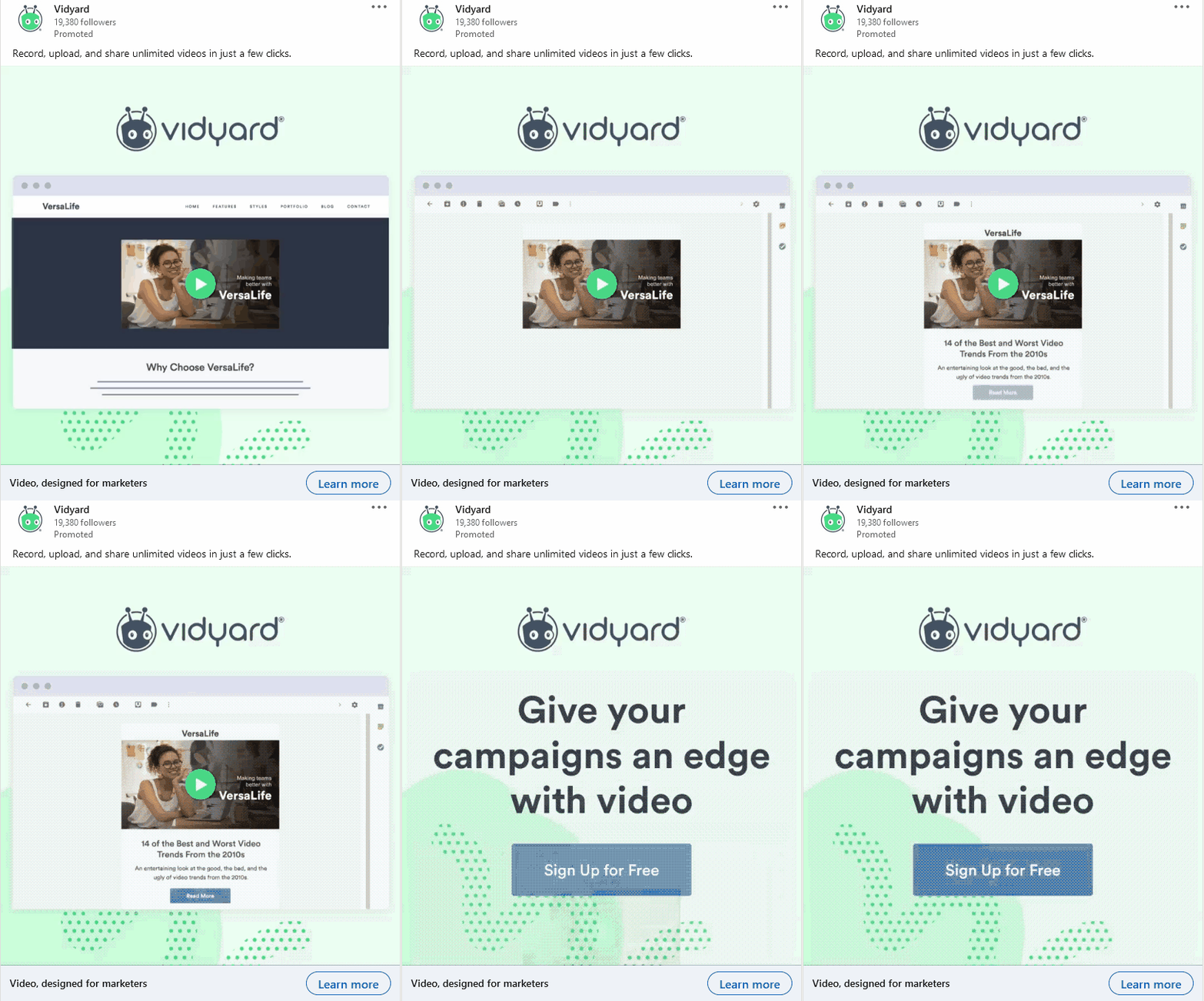
Vidyard is a video platform where you can create and host videos for sales and marketing campaigns — so it’s no wonder they advertise through ads, too.
Their LinkedIn video ad uses a few different backdrops to help the viewer visualize how they could use the software. The ad ends with a clear CTA: “Give your campaigns an edge with video.” Their target audience is also directly mentioned in the ad copy: “Video designed for marketers.”
Source: Vidyard LinkedIn ads
Takeaways:
- Use video to show what your product looks like in action.
- Keep it short and simple (10 seconds).
- End with a clear-cut call-to-action (big, bold letters).
LinkedIn job ad examples
The next few LinkedIn ad examples will feature job listings. Companies know that the only way to find great talent is by casting a wider net. Putting some advertising dollars behind your opportunities on a professional network people already use to look for work can do the trick.
5. ClickUp
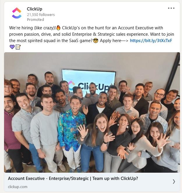
ClickUp has a great ad that promotes their latest job opening. Instead of opting for a regular job ad, they chose to include an ad image and showcase a real photo of the team. You can use this tactic in your overall LinkedIn ad strategy if you want to highlight your brand culture as approachable and friendly.
Source: ClickUp LinkedIn ads
Takeaways:
- Use a fun team picture for advertising open positions.
- Keep your ad copy conversational (see above: “want to join the most spirited squad in the SaaS game?”).
- Don’t shy away from using emojis!
6. Snowplow
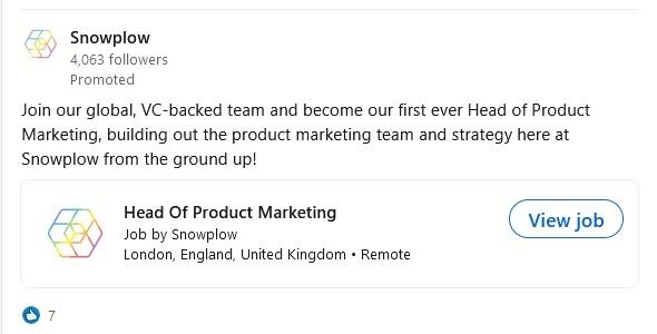
This LinkedIn ad example from data company Snowplow is a simple job posting for those who like to get straight to the point. These promoted jobs stand out in LinkedIn’s feed thanks to the View job button.
Source: Snowplow LinkedIn ads
Takeaways:
- Boost your job postings on LinkedIn to attract more applicants.
- Start your post with a call-to-action, such as “Join our team…”
- Keep the caption short and sweet: you want candidates to focus on the CTA button.
7. Ikontent
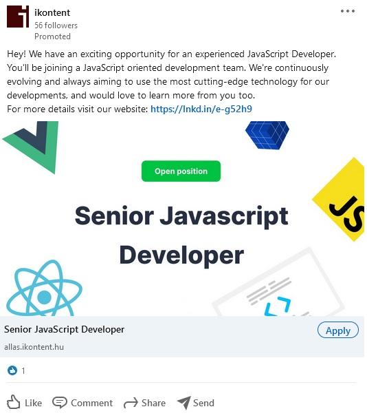
Another way you can make your LinkedIn ad stand out is by using a bold image that spells out the title of your open position. It will be impossible to miss!
Source: ikontent LinkedIn ads
Takeaways:
- Use a bright but not too busy image.
- Don’t use any other text on the banner—make the name of the position the focal point.
- When setting up your ad, use a simple image ad but assign the “Apply” CTA to make it a job promo.
LinkedIn event ad examples
Webinars, fundraisers, and other events can attract large audiences on LinkedIn — so why not advertise them? Below you’ll find a couple of LinkedIn event ads that make the most of their real estate.
8. The Ontario SPCA and Humane Society
If you are working with cute animals, flaunt them!
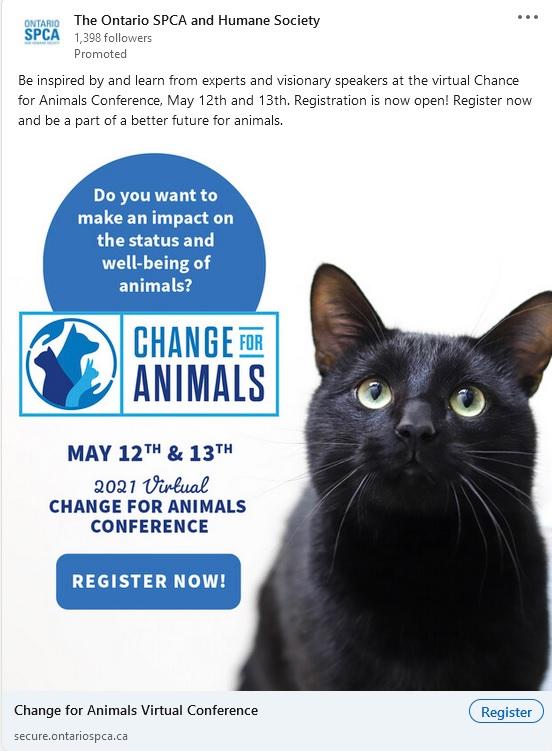
The Ontario SPCA cleverly featured a photo of a beautiful cat in their LinkedIn ad promoting their next conference.
Source: OSPCA LinkedIn ads
Takeaways:
- If your industry allows, use big, bold images as “scroll stoppers.”
- Keep the caption brief but include the most important info on the banner: date, time, and the name of the event.
- Use the “Register” button as a straightforward CTA.
9. Spiceworks
You can also advertise your event to potential sponsors. If you were looking for the best LinkedIn ad to get that specific job done, this one might tick off all the boxes.
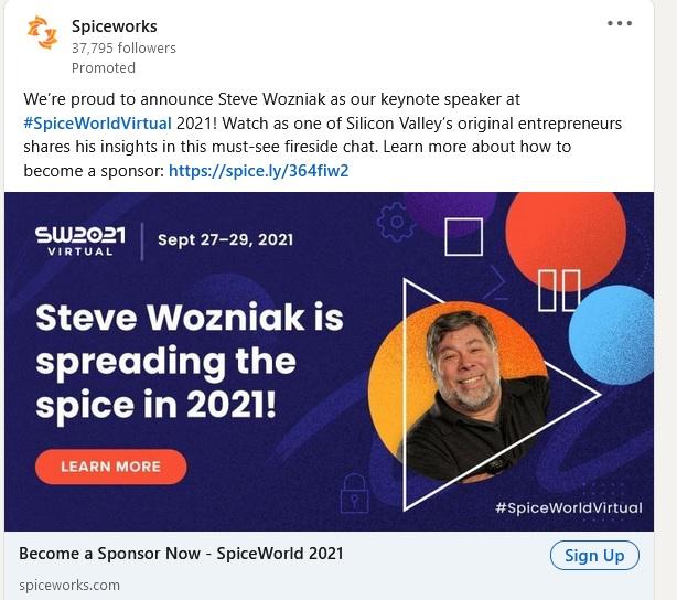
IT company, Spiceworks, is not shying away from name-dropping: they proudly display their keynote speaker, Steve Wozniak, on their ad banner. The banner itself uses vibrant colors to get potential partners excited.
Source: Spiceworks LinkedIn ad
Takeaways:
- If you have a big industry name on your event’s attendee list, highlight them on your ads with big, bold lettering and a photo.
- Featuring your event’s name is great, but getting creative with your headline is better. See above: “Steve Wozniak is spreading the spice in 2021!” is a more interesting headline than “SW2021 Virtual.”
- Events are usually fun, knowledge-rich environments—evoke this feeling in your readers by using bright colors.
LinkedIn message ad examples
LinkedIn allows you to send private messages to your audience (previously known as “Sponsored InMail.” But if you look in your inbox, you’ll probably have a hard time finding good message ad examples. It’s not easy to write a good cold reach out.
Below, you’ll find a few examples that are first-class examples of cold outreach done right.
10. Conversation ad example
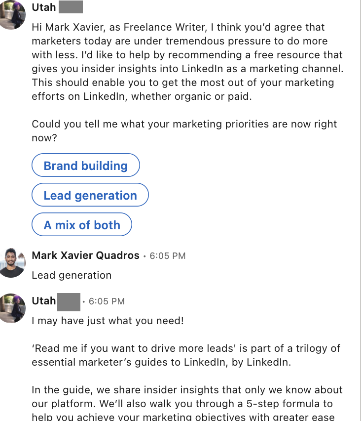
LinkedIn’s conversation ads allow you to break away from old-school cold outreach methods. By adding quick, poll-type buttons to your message, you’ll allow your prospect to go through a “choose-your-own-path” experience. It’s an excellent way to collect pre-qualified leads.
The below ad example does this well. It uses some personalization (see: name, job title) and keeps the message copy short and sweet. They add a one-liner question before presenting three straightforward options. Selecting each option brings the reader down a different path with a different engagement piece at the end (read: a downloadable PDF or a free trial).
Takeaways:
- Always keep your lead gen ads short—you’re on borrowed time in someone’s inbox.
- Make your CTA buttons no more than three words for readability and quick action.
- Use 1-2 personalized placeholders, such as name, title, or company.
11. Message ad example
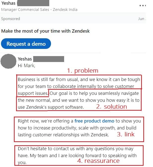
This type of sponsored message ad works well thanks to the single CTA button on the top. It can help you score B2B prospects who receive many messages and can’t be bothered to compose an eloquent answer. The button drives home the main purpose of the outreach and saves time for both you and the recipient.
Takeaways:
How are you helping your recipient? Break down your solution in a logical pattern (see: problem-solution-link-reassurance format) while keeping the copy succinct and to the point.
LinkedIn spotlight ads
The following LinkedIn ad example is a no-frills promo with the benefits of personalization. By selecting the spotlight ad, you can easily showcase your product, service, or event and increase traffic to your website or landing page.
12. LinkedIn spotlight ad example
You have two options in this format: spotlight ads (see on the left below) or Follower ads (see on the right below).
With spotlight ads, you can gain leads by addressing users via their first name and having your logo, and a call-to-action displayed simultaneously. You can do the same with follower ads, except that here, your main goal is to attract new followers to your LinkedIn page.
Source: LinkedIn Marketing Solutions
Takeaways:
- This is the type of ad LinkedIn prefers to be kept short. The headline must be no longer than 50 characters.
- Look up ad copy recommendations on the LinkedIn Marketing Solutions page.
LinkedIn lead ad examples
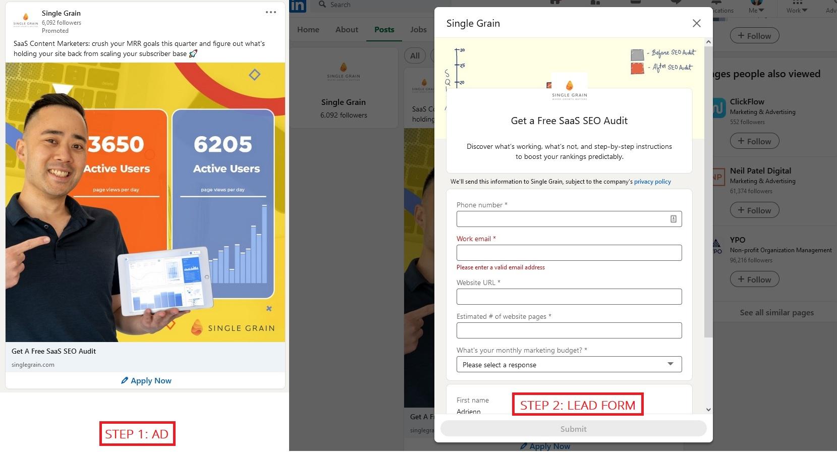
Here’s another LinkedIn ad example that will make your lead generation a breeze. This type of ad requires at least two elements to set up: the ad and the lead form.
13. Single Grain
Single Grain does a great job in grabbing their target audience’s attention. At first look, their bright ad conveys not only an appealing value proposition (getting more active users) but also thought-leadership (by featuring their CEO).
Additionally, they make sure to include a “promise” everywhere. The description promises help with crushing MRR goals. The banner illustrates growing numbers, and the headline seals it with a gift: a SaaS SEO audit.
Source: Single Grain LinkedIn ads
Takeaways:
- Use bright, vivid colors to make your ad pop.
- Make full use of your ad’s real estate by placing an irresistible detail. wherever you can (description, banner, headline, etc.).
14. Piwik PRO
This example is a different type of lead gen ad — it takes the reader to a landing page instead of keeping them on the platform. This setup is best for brands that want more control over the lead form and have a lightning-fast website. Remember that website conversion rates drop by an average of 4.42% with each additional second of load time.
Analytics tool Piwik’s minimalist ad fits the lead gen category well. Both the copy and the banner clearly state what you get if you download their guide. This helps users decide whether they are interested in the offer. This is another way of pre-qualifying your leads without over-explaining yourself in the description.
Source: Piwik LinkedIn ads
Takeaways:
- Lead gen ads ask a lot from the audience: their valuable email address and personal info. Therefore, it’s best to keep the text brief to avoid overwhelming your prospects.
- Clearly state what they get when they download your guide.
LinkedIn ad best practices
You’ve seen some top-notch ads. Now, let’s catalog all the best practices you can apply to your LinkedIn ads strategy.
1. Keep your marketing copy lightweight
The attention span of social media users is getting shorter and shorter. Try to pack only the most valuable information into 150 characters in your descriptions.
2. Highlight the best parts about your offer
Did you partner with a big-shot influencer for your ad campaign? Are you offering an incredible premium or free deal? Flaunt the best parts in your copy and on the banner, too.
3. Know your audience
Think beyond just who they are. Are you targeting software developers? Try making your campaign’s theme around a video game. Looking to reach office workers? Make a nod to The Office just like KPMG did in the second example. It’s a great way to instill a sense of “wow, they get me!” feeling in your audience.
4. Add lots of CTAs
Your headline and CTA button are not the only spots to tell your readers what’s next. Sprinkle CTAs in your description and on the banner image, too, to bring home your message.
5. Go beyond a single campaign
Multiple touchpoints help build brand awareness and drive sales. Launch a few different types of LinkedIn ads at the same time. For example, you could target the same audience with message ads, as well as sponsored content that shows up in their feed.
6. Test, test, test
If you have the capacity, add an A/B test here and there, too. Once you’ve been running your ads for a couple of days, check in and pause the worst performers to optimize your spending.
Want to dive even deeper into LinkedIn ads? Check out this in-depth LinkedIn ads guide for more tips.
Next: Wow your audience with your LinkedIn ads!
Use these first-in-class LinkedIn ad examples to get inspired for your next campaign on the platform.
Take note of the different creative styles and unpack what would work best for your brand. It’s OK to run ads with a bit of personality (or even humor), as well as to-the-point awareness ads, as long as you feel they can both carry your tone of voice.
Good luck!


Leave a Reply