If you’ve ever waited in line at the grocery store and seen the people in front of you scroll through their Facebook or Instagram feeds on their phone, you’ll know each post is only glanced at for about a second. Unless it captures their attention.
One second! That’s how much time we’ve got to hook people in with our Facebook (and Instagram) ad and get them to want to read more.
This is why, as a Facebook marketer, when I coach clients on their ad strategy the part where they get overwhelmed is the one related to the creative for the ad itself.
Often the optimization and audience selection is taken care of by Facebook, but the possibilities when creating the Facebook ad itself are completely open-ended.
For example, if you have an eCommerce business the chances are you’ll optimize the campaign for purchases and use a value-based lookalike of purchasers for the audience so it’s relatively easy to pick the optimization and audience.
Where do we start with the ad creation though? To help you we’ve created this simple guide covering the 5 steps of Facebook ad creation so that you have a template that you can use to quickly and repeatedly create high converting Facebook and Instagram ads.
Ready to start climbing the first of this 5-steps guide? Wait a minute. First, there’s one more (and most important) step to do!
Start By Learning From the Best
If you want to scale your business through advertising in 2020, it’s essential to be running Facebook and Instagram ads. But with ad prices rising year on year, it’s no longer possible to just rely on cheap traffic to succeed. On both platforms, there’s more complexity than ever before, such as Instagram Story ads and Messenger ads. Therefore a solid strategy is required to achieve good results in 2020.
This is why we decided to open this year’s webinar series with a not-to-be-missed FREE appointment: How to Get Started with Facebook and Instagram Advertising in 2020.
Click here (or on the image) to reserve your FREE seat
During this exclusive one-hour live training our Head of Education, Paul Fairbrother, will cover everything you need to know to put an actionable plan in place to start advertising across the Facebook family of apps and increase your number of leads, sales and store visits. There will also be time for a Q&A session, to answer any questions you have.
It’s completely free so don’t wait, sign up today! Click here, it only takes you a minute, then come back to keep on reading the post!
Anatomy Of A Facebook Ad
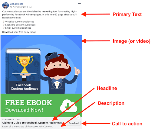
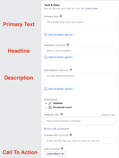
When we look at a standard Facebook newsfeed ad we can break it down into 5 separate parts:
In order of importance they are:
- Image or video
- Headline
- Primary text
- Call to action
- Description
By breaking down something complex like an ad into 5 steps it’s much easier to create each piece step by step.
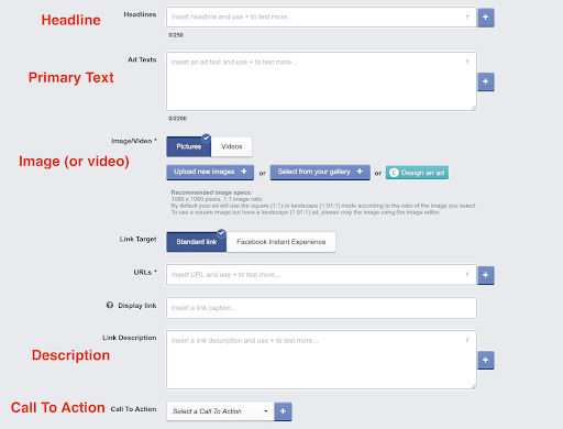
As luck would have it this is the process used when designing an ad in AdEspresso, just go through the 5 steps plus add in a URL:
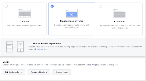
It’s a similar process in Ads Manager, start by selecting an image or video…
…then complete the other 4 steps:
Facebook ad Creation Step #1 – Images And Video
Are images or videos best? In a recent $1,000 experiment we found that standard image ads outperformed carousel and slideshow video formats. By all means use video, especially if you have a more complex product that needs explaining, but for your first campaigns consider using images so that you can get your creative produced as quickly and as cheaply as possible.
Images
Best ratio for standard newsfeed ads: square
Recommended size: 1080 x 1080 pixels or above
Note that the image should have under 20% text coverage to ensure maximum delivery, this can be checked using the Facebook Text Overlay Tool.
For social media, often images that aren’t too polished perform well as they look like organic posts from users rather than looking like an advert. This is great news, as it means for your first campaigns an iPhone or similar quality Android device is all you need.
If you’re selling services or training courses why not try face to camera images? After all, people buy from other people.
If you are selling products, a quick camera phone image to capture a lifestyle photo of the product being used in a natural setting can work well. Most smartphones have built-in cropping and filtering tools, and a free or inexpensive tool like Canva can be used for further editing.
Videos
Best ratio for standard newsfeed ads: square
Recommended size: 1080 x 1080 pixels or above
Recommended length: 15-60 seconds
Just like an image ad, you don’t need the video to be too polished for social media so you can use a smartphone when starting out, especially as Facebook suggests that 15 seconds is the ideal length for a video ad. There’s also plenty of editing apps, check out some suggestions in our blog post.
Don’t forget you also need a thumbnail image for the video. If you’re just starting out, simply pick one from the video itself. If you have time though, our $1,000 experiment demonstrated that a custom thumbnail image is worth it. The thumbnail has to adhere to the same 20% text rule as image ads do, but you can have more text in the rest of the video.
Facebook ad Creation Step #2 – The Headline
After the image or video, the headline has the most impact on ad performance. However, there’s only room to squeeze in a maximum of approximately 7 words so keep it brief. Don’t try and get too clever, instead get straight to the point.
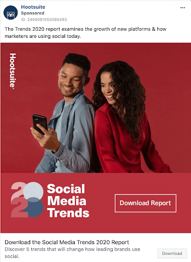
Check out this example from Hootsuite:
“Download the Social Media Trends 2020 Report,” tells you everything you need to know even if you couldn’t see the primary text or graphic.
There’s a real art to reducing everything down to 7 words, we aim to eliminate everything that isn’t needed to leave a strong the call to action.
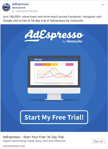
Another example is an ad we use ourselves at AdEspresso:
If there’s room, it’s good to state the brand name in the headline even though it is mentioned elsewhere; with users scrolling through their feed so quickly we need to make the headline as obvious as possible.
Just like in the Hootsuite example, “AdEspresso – Start Your Free 14-Day Trial” tells you everything you need to know even if you can’t see the rest of the ad.
Note: headlines don’t appear in Instagram ads so if there is something important in the headline such as a coupon code mention it in the primary text as well.
Facebook ad Creation Step #3 – The Primary Text
This is the portion of text that sits above the image or video. It can be as short or as long as you want, but keep in mind a couple of points:
- On some of the non-newsfeed placements, the text will get truncated to a maximum of 125 characters
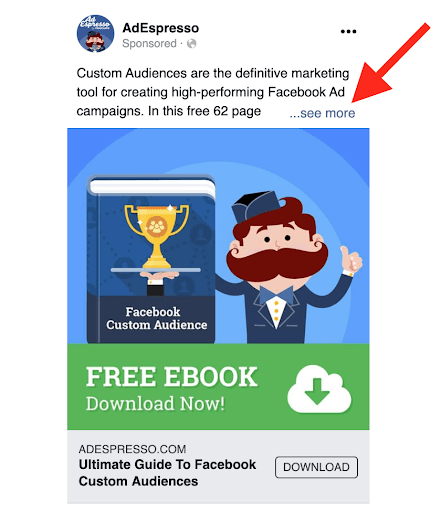
- On mobile newsfeed – which is our most important placement – only the first 3 lines are shown before the “see more” option needs to be clicked to see the full ad text, as shown in the mobile version of the ad we analyzed above:
That means we need to front-load the text, i.e. put anything important in the first sentence.
How long should the ad text be? In one of our famous $1,000 Experiments, we found a lot of variation in performance between different lengths of text, and overall one paragraph was the ideal length.
This isn’t a rule set in stone as complex products require more text and well known simple products require less. However, one paragraph makes for a good starting point.
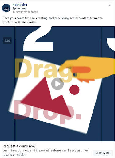
Try and cover one feature and one benefit. A benefit is essentially the reason why the prospect should care about the feature that you have just stated. In this Hootsuite ad below the feature is “create and publish social content from one platform” and the benefit is “save your team time”:
Facebook ad Creation Step #4 – The Call To Action Button
The call to action – CTA – button encourages users to click on the ad and visit your website. Although you don’t have to include a CTA button, our $1,000 experiment shows that it does significantly increase the number of website conversions.
Ads manager provides a menu of available CTAs instead of an option to create your own. The CTAs available depend on the campaign type, but below we’ve listed what is available for a standard conversion campaign:
Learn More is a good default option if you’re not sure which one to pick. Apart from that the most commonly used options are Shop Now for eCommerce and Download if you are advertising a lead magnet.
Facebook ad Creation Step #5 – The Description
This section of the text sits underneath the headline and won’t be displayed for all placements. Usually, this means it will be displayed on desktop newsfeed only or sometimes on the mobile newsfeed but only when the headline is really short and leaves space for the description.
To further reduce its importance, Facebook states:
The description will be shown in your ad if it’s likely to resonate with the person seeing it” i.e. even on desktop it might not be shown to all users.
This means it is of minor significance, so put anything that is important in the primary text or headline instead. However, it’s still worth filling in the description because if it is left blank Facebook can pull in text from the website itself which isn’t always ideal.
There’s only room for approximately 6-8 words so keep it short and to the point e.g. “free shipping over $50” or “offer ends on Sunday”.
And There’s More!
If you’d like more assistance with designing the perfect Facebook ad there’s a chance you can’t miss: our first FREE webinar of 2020:
Just click here (or on the image above) to reserve your seat for this unique one-hour live training with our Head of Education Paul Fairbrother!
Not only he will cover everything you need to know to boost your business with Facebook (and Instagram) ads, he will also answer any questions you have in an exclusive AMA (ask me anything) session at the end of the live event!
While waiting for our webinar to start (or to get your free copy of the recording) you can also download our free ebook Facebook Ads Templates for Better Ads.
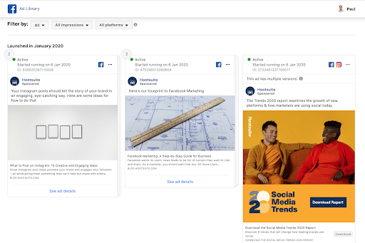
Need more resources? Often a good place to start if you don’t know what theme to use for your ad is to get inspired by brands you admire, or alternatively your competitors.
Check out our Facebook Ad Examples guide or visit Facebook’s very own Ads Gallery for a complete gallery of all ads that are running, plus an archive of political ones:
There’s also documentation available from Facebook on their ad specifications for each format and the official Facebook Advertising Policies, they’re worth a read to ensure your ads won’t get formatted incorrectly or rejected.
What tips do you have for rapidly creating highly effective ads on both Facebook and Instagram? And what are the main pain points you face? Let us know in the comments below.

This post explains all the steps that one must be aware of before creating a Facebook Ad. I absolutely agree with the fact that creating a proper headline, writing primary description and choosing the relevant CTA button is a very important aspect of Facebook Ad creation.