The Ultimate Google Ads Guide
Chapter 6
How To Setup a Landing Page That Converts
Landing pages are the pages that searchers will arrive at when clicking on your Google ads.
Landing pages are an essential piece of the Google Ads puzzle.
Good landing pages will help users convert and complete their purchases on your website.
Bad ones will tank your sales and cost you thousands of dollars in clicks without any sales to show for it.
In this section, we’ll showcase great landing page examples
and best practices you can follow to drive more conversions.
Remember: if you get your keywords, your audience and your ads right but not your landing pages… it won’t matter!
What Are Landing Pages? The Best Examples From Top Companies
Landing pages are simple in practice:They are individual pages on your website that are specifically created to entice a user to buy from you or complete an action.
They aren’t usually existing pages on your website, like your homepage.
Landing pages are stripped of most navigation elements and focus mostly on the offer that you present to a given user.
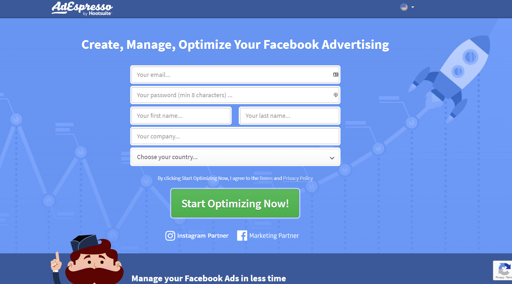
For instance, this is an AdEspresso landing page for a free trial of their software:
The typical navigation menus that you’d see on the home page aren’t on the landing page.
Why? It helps to focus the attention on the offer and not give users external routes to leaving the page.
The sole purpose of the page is to drive action.
Most new advertisers on Google Ads make the mistake of using their homepage as the landing page because it contains similar content like calls to action and detailed information on the products or services offered.
But this is a big mistake.
There are too many other elements that distract users from converting and the content isn’t specific enough to each ad group.
In a perfect world, every ad group you make should have its own keyword and content specific landing page.
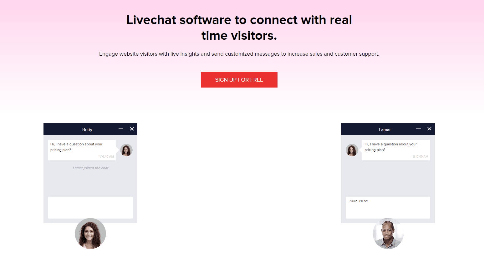
One of the best examples of this is from Zoho, a livechat software company.
Conducting a search for “livechat software,” I clicked on their ad and was directed to a specific landing page mentioning the exact keyword I searched in their headline with a clear CTA in the middle.
That’s what you want to see on an Google Ads landing page.
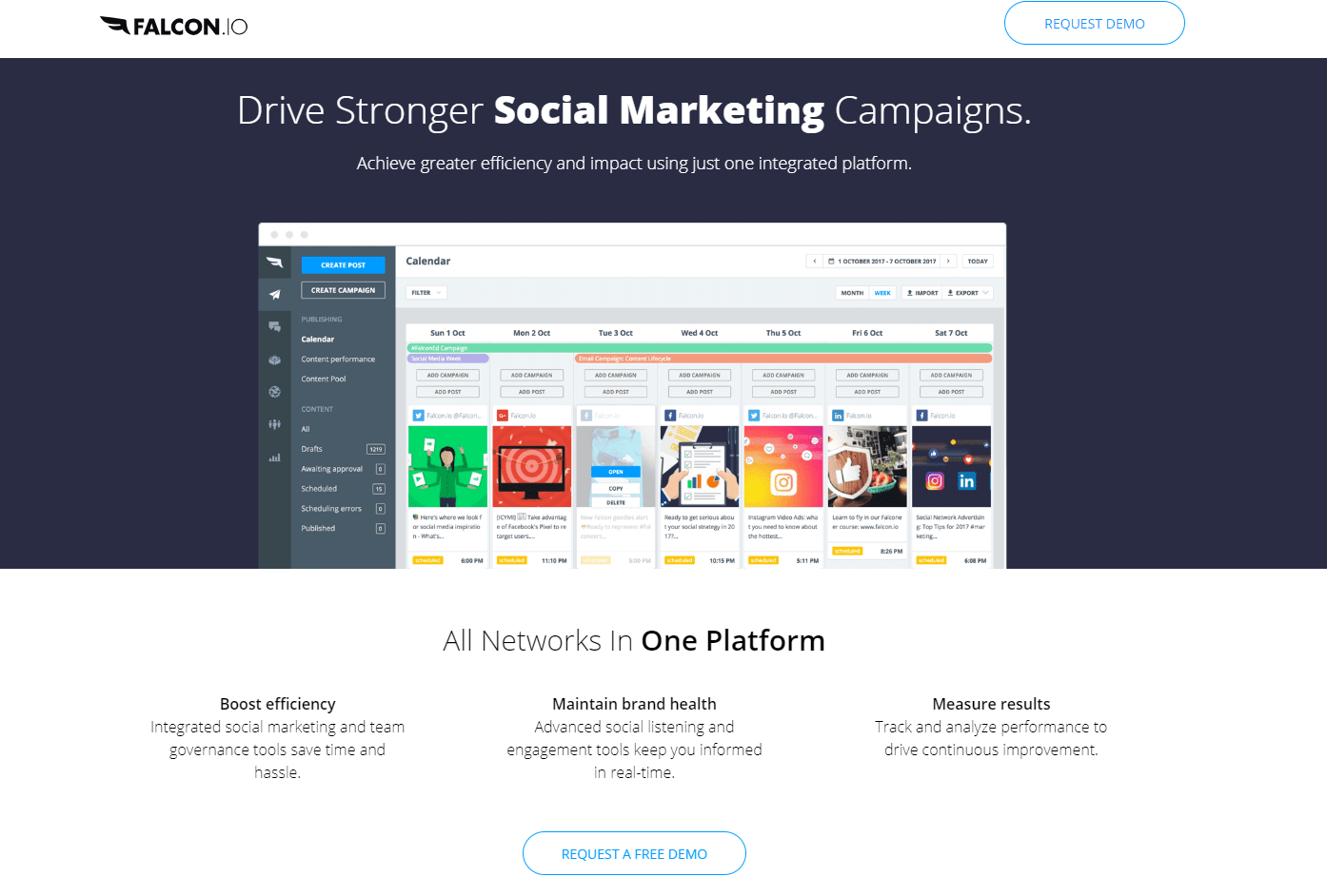
Another great example is from Falcon.io, where navigation elements are eliminated, and the main part of the keyword searched is actually highlighted in a different colored text to stand out:
With CTAs on the header and the body, users can convert from anywhere they want.
Before creating your next landing page,
here are a few key factors that make up a great landing page.
Google Ads Landing Page Best Practice #1: Message Match
Message match is the idea of conveying the same message and offer that your ad and keyword does. It’s simple but often overlooked.
It goes all the way back to the root of the search: keywords.
Keywords pack different intent and therefore, users expect certain things when they search.
For instance, searchers typing for “seo guide” clearly want a guide to help them with SEO, not an agency to hire, right? Right.
It’s imperative to put yourself in the shoes of the searcher to understand what they’d likely expect out of the search.
Next, you carry that information over to your ad to reassure the searcher that your content is what they need.
Lastly, your landing page should convey a matching offer that doesn’t exceed or miss expectations.
Going back to the SEO guide example, your landing page would need to display an SEO guide in exchange for an email.
You can’t trick people into clicking for an SEO guide and demand they pay or hire your agency.
More commonly, advertisers will fail to repeat their offer on a landing page, leading to confusing experiences for users.
Even small moments of hesitation can be devastating to your conversion momentum.
Let me show you an example.
I recently searched for a social media marketing tool. I found this ad from a company and the 90-day trial was very compelling. 90 days! That’s huge.
So naturally, I clicked through to their landing page. But instead of being told to sign up for my 90-day, risk-free trial, the call to action was this:
What happened to the 90-day trial? This CTA is unclear and leaves me guessing if that 90-day offer is still there.
I don’t know what to expect when clicking on “Get Started Today.”
If the call to action said “start your 90-day free trial now,” you can bet that I’d click.
Now, let me show you a great example of successful message match.
I searched for another social tool and saw another trial offer:
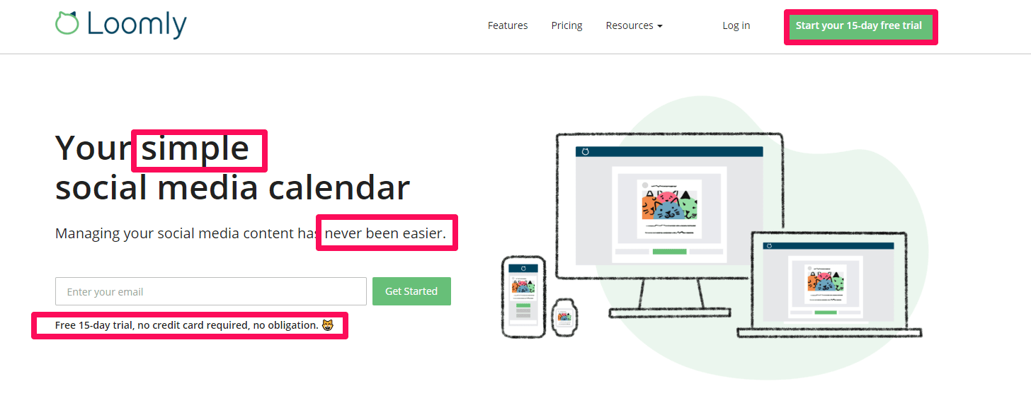
Clicking to the landing page, I was met with exactly what I expected to get:
They repeated the 15-day free trial offer twice in the above-the-fold content alone. They also used the same language as their ad, including terms like simple, easy, and no obligation.
That’s perfect message match.
When creating your landing page, make sure that the offers on your page match your ads.
Re-use keywords and text from your ads to inform your value proposition.
Google Ads Landing Page Best Practice #2: Value Propositions
Value propositions are short statements that seek to explain to a potential customer the value of your product to their needs and wants.
Just browsing the internet, you’ve seen thousands if not millions of value propositions. On almost every single website you can spot a value proposition in the first few sections of content.
Check out this landing page and see if you can spot the value proposition:
Utilize intelligent chatbots to improve customer engagement. The value of this product is helping businesses improve engagement with their customers.
Your value proposition should be concise and should explain the final benefits that customers can expect, not features.
For example, nobody really cares about chatbots. Heck, most probably don’t even know what they are. But people definitely care about improving customer engagement.
Focus on benefits, not features.
Keep your value proposition concise (1-2 short sentences) and display it at the center of your landing page header below your headline (keyword).
Google Ads Landing Page Best Practice #3: Ensure Your Page is Mobile Friendly
While both of the above tips play a huge role when it comes to a high-converting landing page, this guide would be incomplete without adding one glaring issue – site speed.
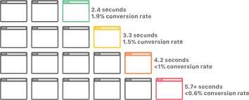
Just how important is it? Take a look at this graph from CloudFlare:
In just 3 seconds, you can go from a good 2% conversion rate to less than half a percent.
Depending on your traffic, that means thousands of potential leads are trickling out of your lead funnel like a hole in a boat.
Not only does this problem affect your landing page conversions, but ultimately, it will affect your Google Ads rankings as well.
One of the biggest factors of your Google Ads Quality Score happens to be site speed score. While it always was a factor since 2009, in 2018 Google made this factor an even bigger part of their overall Quality Score metrics.
In addition, ensuring your page is easy to navigate from a mobile device (as well as a speedy load time) is critical to ensuring your success with Google Ads. If you’re looking for tips on how to do just that, check out our blog post here.
Now that we got all that out of the way, it’s time to spend some money! But bidding can be complicated for a new Google Ads user.

